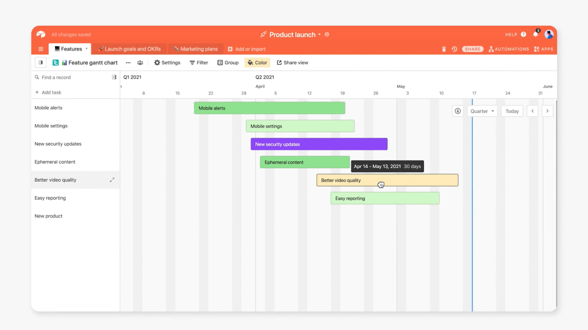
Clean UI and pops of colour.
When it comes to fast product adoption, walkthroughs play a big part. That’s why Airtable is putting together a library of customizable template tutorials that let users create personalized views for every need. There isn’t a better way to educate than with quality video.
This was actually Vidico’s second project for Airtable! You can view our first project (an app video), here.
When working with a complex & powerful platform such as Airtable prioritisation is key to ensure the features can be communicated throughout the video and viewers had time to focus on each one.
Airtable has a wide colour palette, we leveraged these throughout the video keeping it modern and fresh whilst taking care not to overuse these colours. To achieve this we kept the UI and backgrounds minimal and utilised pops of colour throughout.
Research was key when approaching a project for such a bespoke company. We reviewed previous brand videos and assets, as well as current brand guidelines to ensure the video remained bespoke, engaging and yet closely branded.