Production
Nutrislice is a non-commercial foodservice technology company that elevates the customer experience with digital ordering, menus and signage – while making operators’ lives easier.
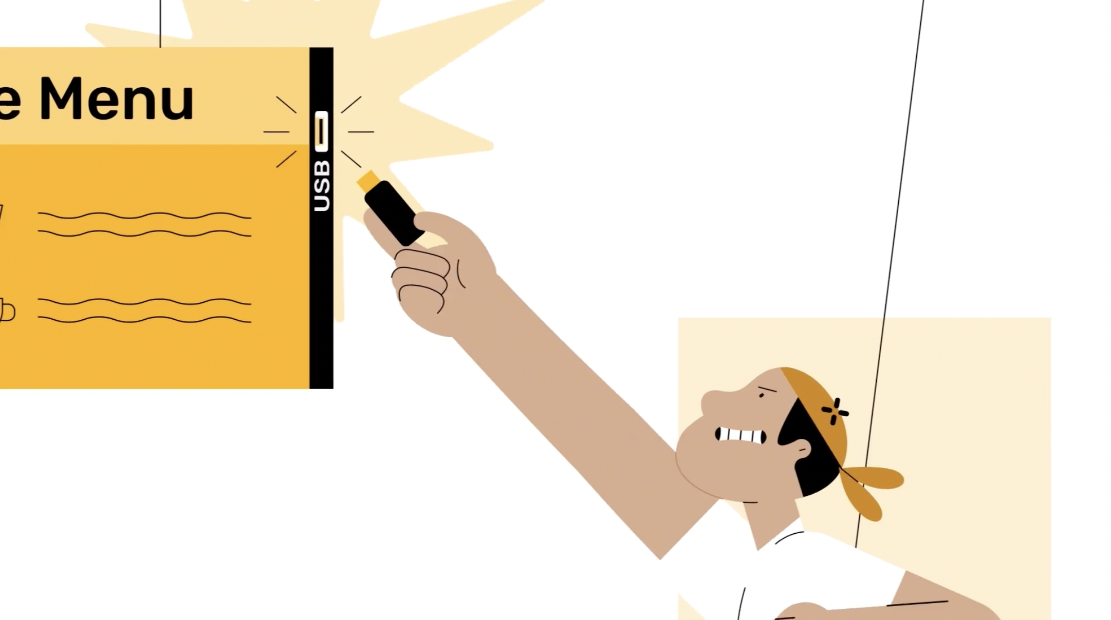
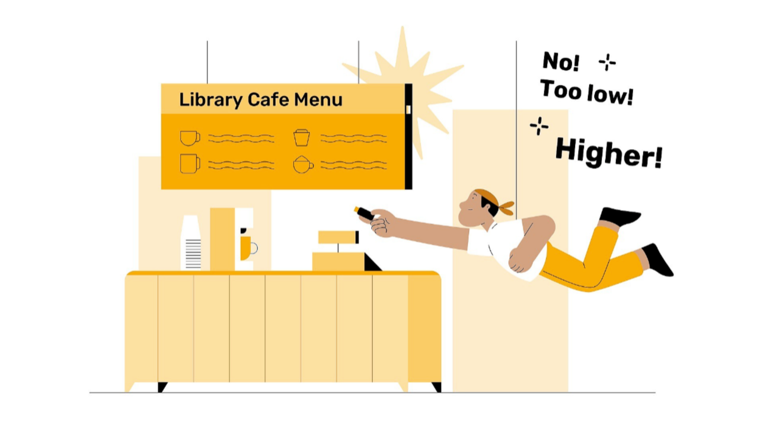
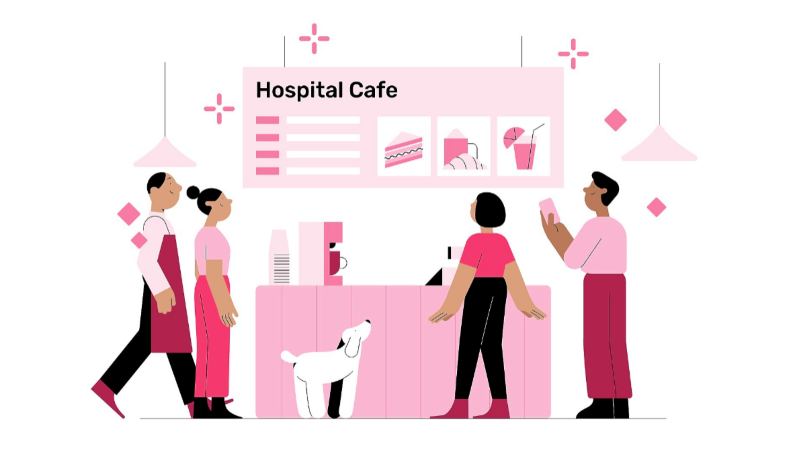
Together we forged a unique, bespoke visual style that is tied directly to the Nutrislice brand. The high level design approach was to showcase lots of brand personality and colours, staying within Nutrislice’s established brand guidelines, whilst building a bespoke illustration from the ground up.
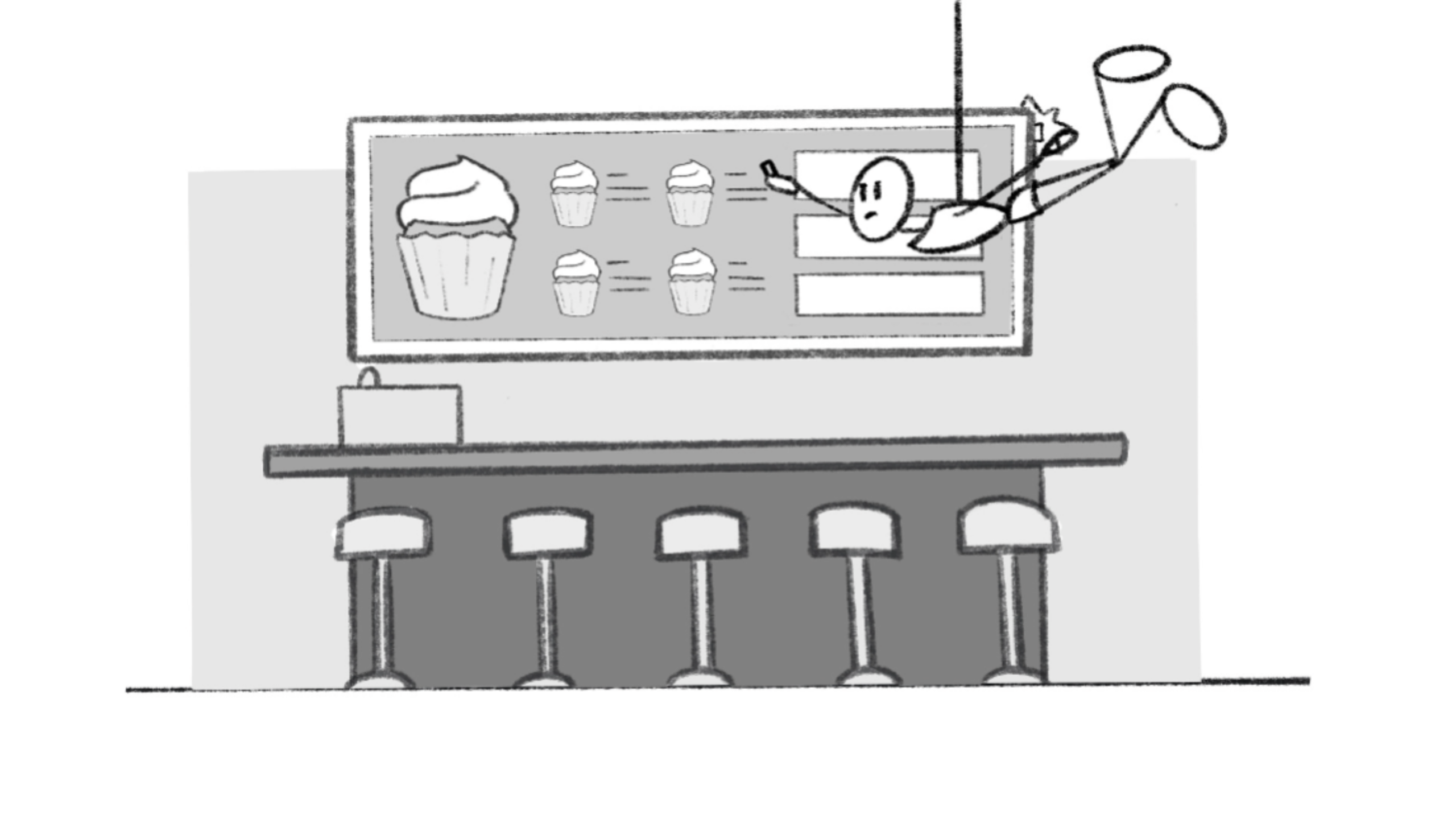
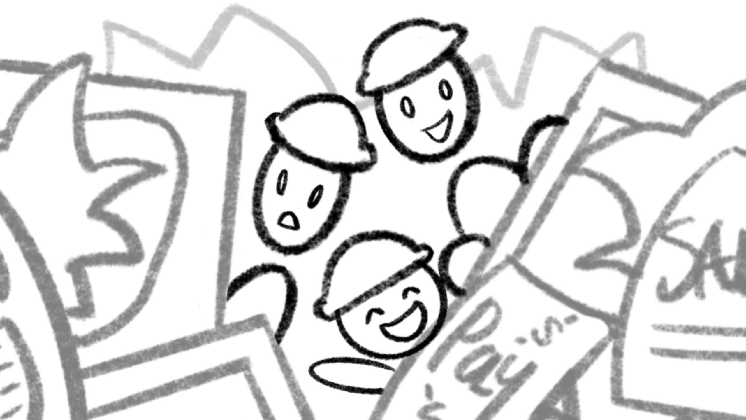
The mood and visual style is light-hearted, human, and charming, with the visual content centred in the frame, encircled by white space. To allow timing and comedy to remain front and centre, characters and environments were kept simple, and a unique monotone colour palette focusing on one of the Nutrislice brand colours was chosen for each video.
1. Mission USB-Free
2. Quest For Signage Simplicity
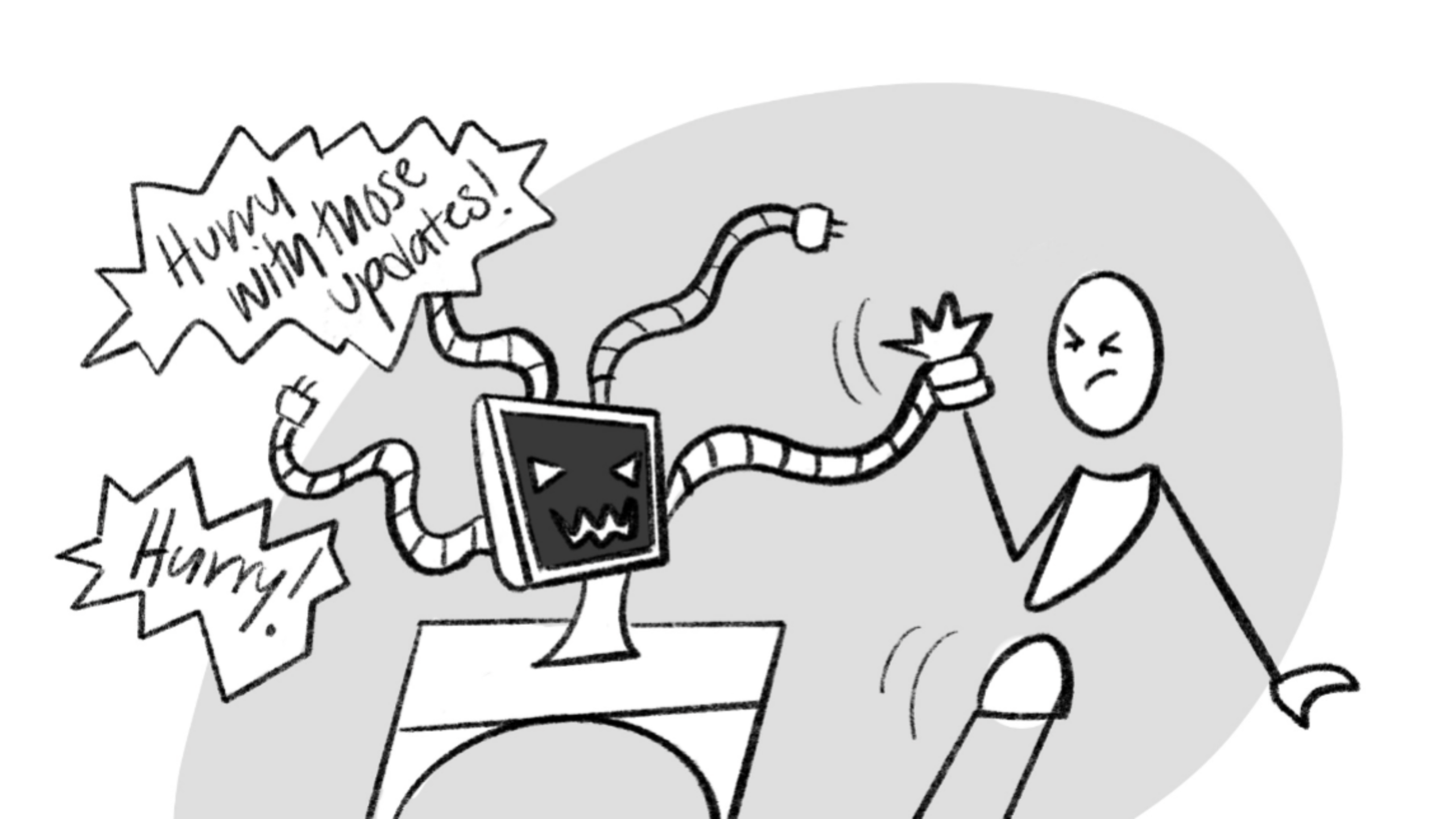
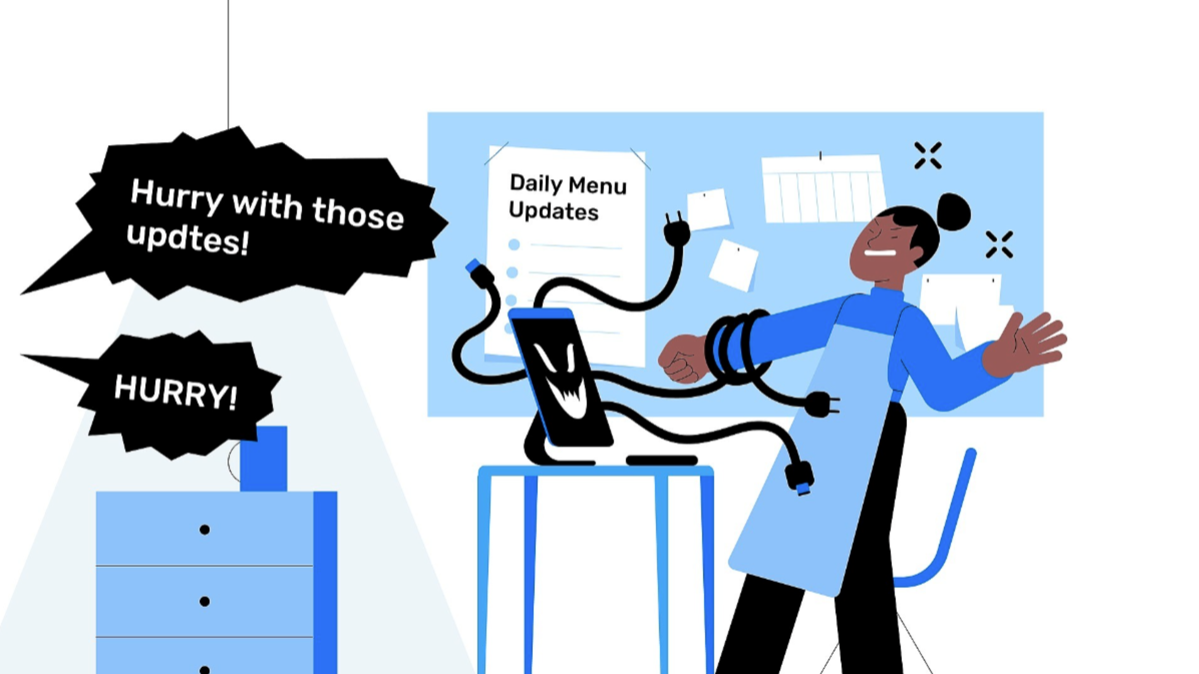
3. The Menu Monster
4. Menu Symphony
5. Screen Envy
Production Process
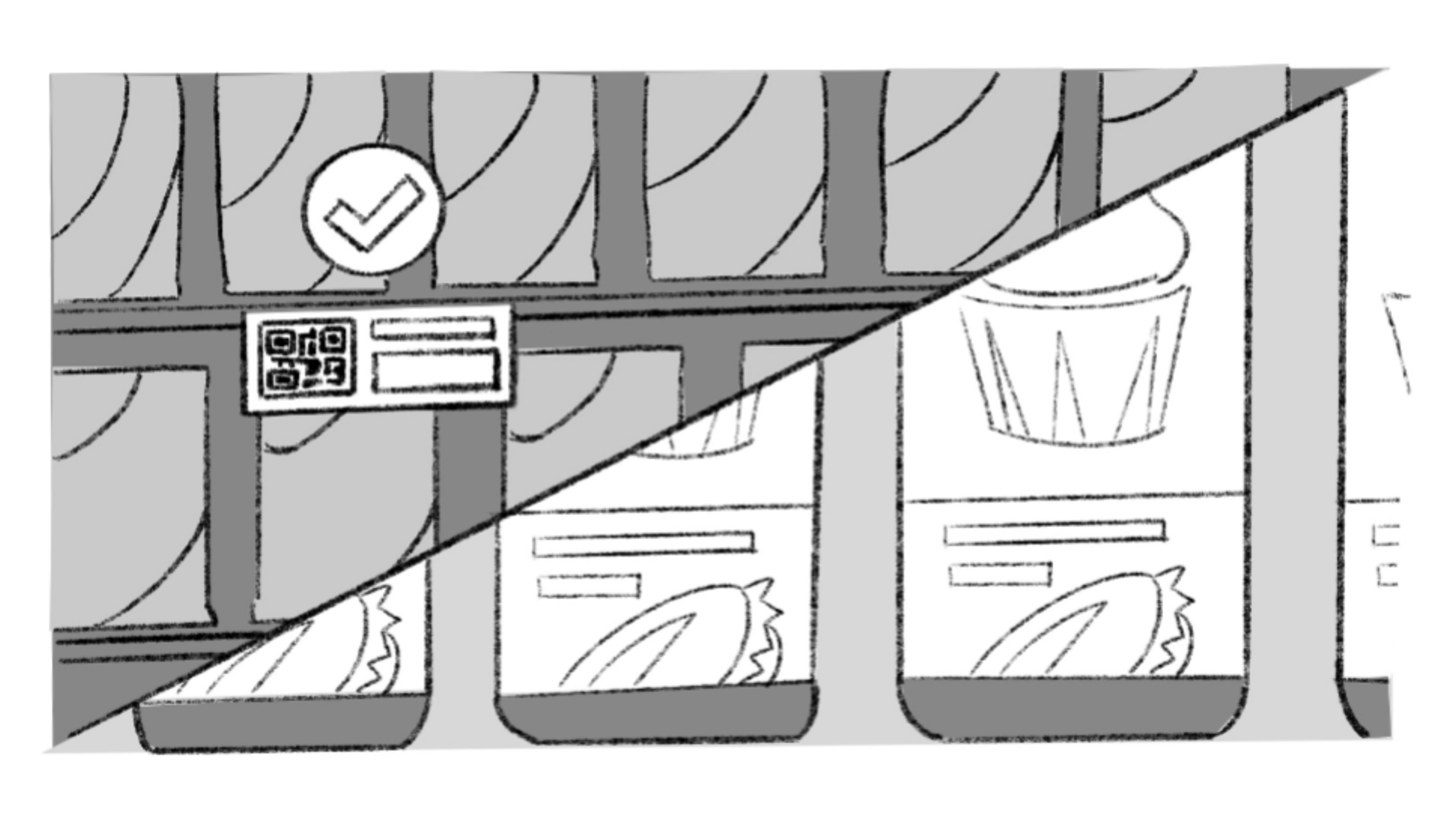
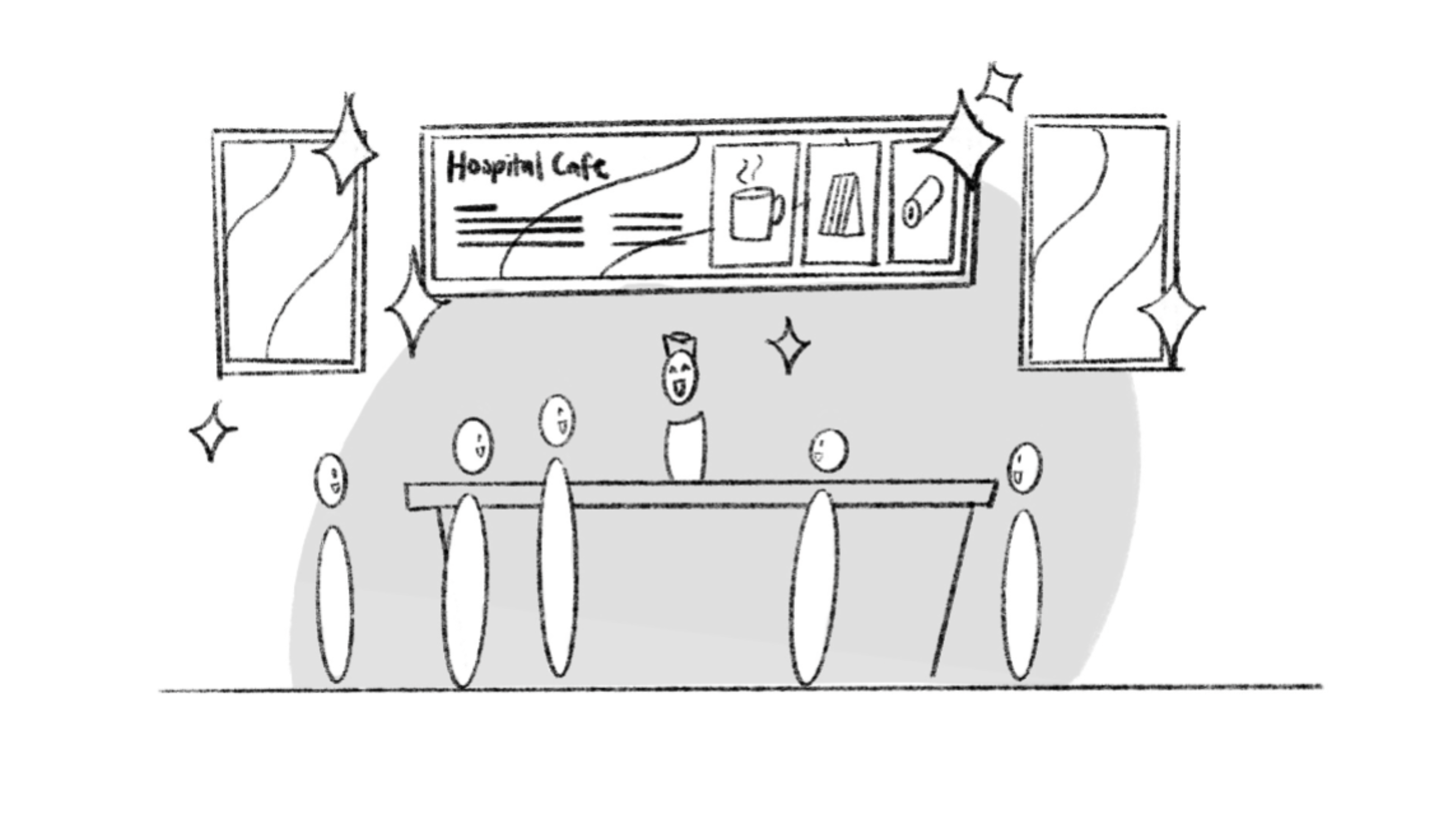
Storyboards
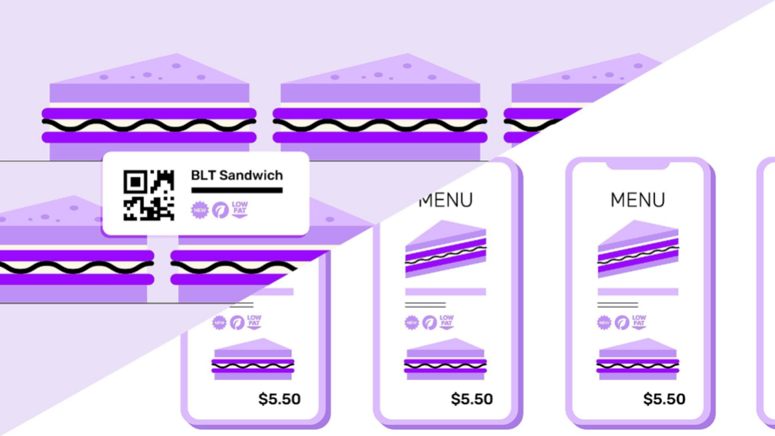
Frames

Animations

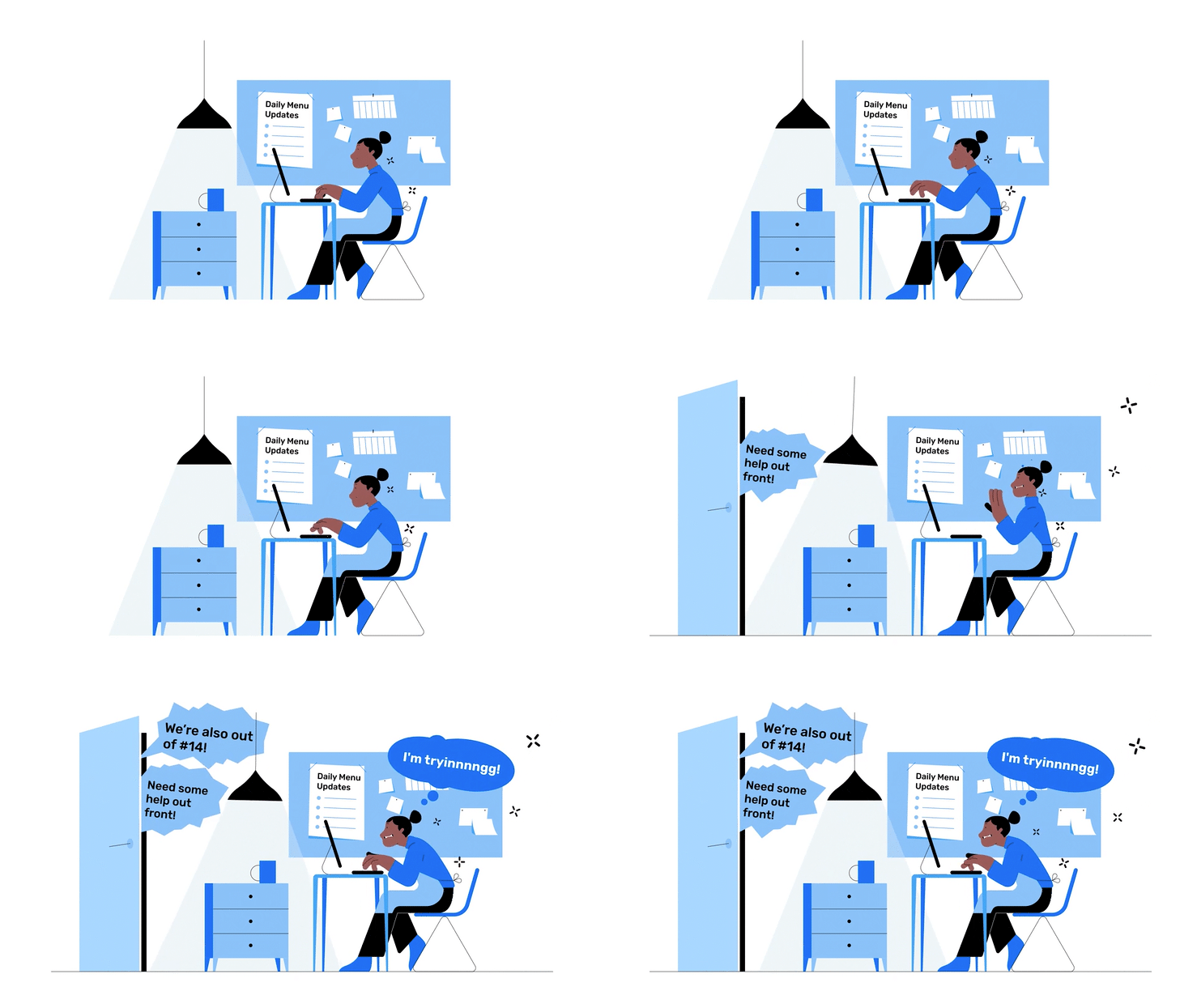
The animation team was very excited to take this project on – it’s not often that we get a project that relies on animation for its messaging, with no script or VO, and minimal on-screen text. This project would allow the team to flex what they do best, which is communication through animation.
Nutrislice were overjoyed with the final outcome, and we’re currently in the early stages of production on the next series of animated shorts, which are leveraging the existing style to communicate more ways the Showcase technology can solve customer pain points, as well as other solutions offered by Nutrislice across both hardware and software. We’re excited to see how the videos perform once officially launched across all digital channels and for the bright future of our relationship with the Nutrislice team.

