Social media isn’t optional for high-growth tech brands—it’s a daily test bed for their brand.
As a marketing director or growth leader at a fast-growing company, you’re facing a common challenge: keeping visuals sharp, consistent, and on-brand across LinkedIn, TikTok, and Instagram. As your team scales, creative requests multiply, but you’ve discovered that more output shouldn’t require more headcount.
After partnering with 200+ tech companies, we’ve identified what separates sustainable social media systems from scattered, piecemeal processes. Our systematic approach has helped clients increase creative output by 400% while reducing production costs by 40% compared to traditional design methods.
In this guide, we’ll explore how top tech brands scale social creativity through systems (not staffing), examine the specific principles behind high-performing social media graphics, and provide a framework for developing visual content that grows with your business rather than limiting it.
Content
Why Social Media Graphics Matter for Tech Brands

The Visual-First Nature of Modern Social Platforms
Major social media platforms today are built for visuals first—and everything else second.
Whether it’s a LinkedIn carousel, an Instagram Reel cover, or a TikTok thumbnail, graphics dictate what gets seen, clicked, or ignored.
For tech brands trying to explain complex products in seconds, creating graphics with compelling visual design isn’t just helpful—it’s essential. If your graphics don’t catch attention instantly, your message will not land.
How Graphics Drive Engagement Metrics
Strong social media graphics don’t just look good—they perform. Branded visuals improve click-through rates, increase watch time, and encourage more shares and saves.
They also play a major role in feed ranking algorithms, rewarding visually engaging content.
At Vidico, we specialize in creating platform-optimized designs tailored for TikTok, Instagram, LinkedIn, and more—ensuring your content not only gets noticed but also builds a real connection.
Our campaign for TikTok Shop garnered over 1 million organic views in just five days, surpassing expectations and demonstrating the impact of native-first creative.
Your audience deserves content that resonates with them. Let’s collaborate to bring your vision to life.
Ready to get started? Book a free intro call with our team today.
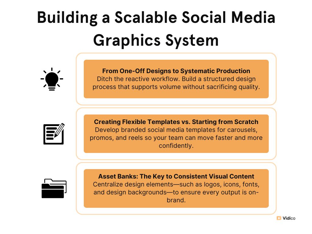
The Cost of Visual Inconsistency Across Channels
Mismatched colors, off-brand fonts, and random layout choices may seem minor, but they compound quickly across multiple social media posts and platforms, resulting in the loss of brand identity [2].
Inconsistent graphics dilute brand recognition, confuse your audience, and make your team appear disorganized in social media advertising.
For scaling tech companies, this often happens when creative is handled ad hoc—piecemeal requests to freelancers or internal designers without a shared system.
The result? More time is spent correcting mistakes, fewer assets are reused, and opportunities to build brand identity through design are missed.
Want to see how we approach content at scale? Check out our video on The Way to 100x Content
Key Principles of Social Media Graphic Design
Visual Hierarchy
Your audience processes visual content in fractions of a second. That means every graphic needs a clear focal point—usually a bold headline or striking image—followed by supporting elements.
A strong hierarchy helps viewers absorb your message quickly and keep it in order, especially when scrolling fast.
Brand Consistency
Design systems ensure that every graphic—whether for LinkedIn or TikTok—feels like it came from the same brand.
Logos, fonts, color palettes, and layouts should be standardized and reused intentionally. This level of consistency reinforces recognition, builds trust, and removes the guesswork for your team.
Simplicity
Overloading a single graphic with too much text or visuals kills clarity.
The most effective social media posts convey oneclear message. Use minimal copy, one strong image or illustration, relevant images, and a clear CTA if needed.
Less clutter = more impact.
Typography
Social content is consumed on everything from desktops to smartphones—and mostly, it’s mobile. Choose clean, legible fonts and test for readability at small sizes.
Avoid decorative typefaces that look great in Figma but get lost on-screen.
Looking for creative strategies for 2025? Watch our short video on What You Need from a Creative Agency in 2025
Color Psychology
Color isn’t just aesthetic—it’s strategic. Use color to set the tone, draw attention to key elements, and evoke the right emotional response (trust, urgency, optimism).
For tech brands, a balance of brand colors and intentional contrast can boost visibility and recognition.
White Space
Good design needs room to breathe. White space helps guide the eye, reduces visual fatigue, and emphasizes key messages.
It’s especially important on busy social feeds where your graphics compete simultaneously with other social media graphics.
Accessibility
Designing social media graphics with inclusivity matters. High-contrast text, readable fonts, and alt text (where supported) ensure your graphics are accessible to all users—including those with visual impairments.
Accessibility isn’t just a design nicety—it’s a brand responsibility.
Step-by-Step Guide to Creating Effective Social Media Graphics
1. Define Your Objective
Before you open a design file, clarify whythis graphic exists. Are you trying to drive clicks, build awareness, or highlight a product feature?
Knowing your goal helps shape everything from layout to copy length. Visually appealing graphics aren’t just beautiful—they’re purposeful.
2. Know Your Social Media Platform
Each social channel has different specs, audience behaviors, and engagement patterns. A LinkedIn carousel requires clarity and professionalism, while an Instagram story is visual and fast.
Design with each platform’s context in mind—dimensions, text limits, and swipe or tap behavior all matter.
Want to master your creative brief process? Check out our Creative Brief Template to streamline your next project.
3. Start With a Brand Foundation
Use your established design system as the starting point: logo placement, spacing rules, grid systems, and tone.
This ensures every asset feels connected—even if it’s created by different team members or adapted across campaigns. Systems beat guesswork every time.
4. Select High-Quality Imagery
Stock photos and generic high-resolution images won’t cut through busy feeds. Use high-quality images that feel fresh, authentic, and aligned with your product or message.
Whether custom illustrations or branded product shots, your images should tell part of the story without relying solely on text.
5. Apply Your Typography System for Brand Recognition
Typography builds visual rhythm and hierarchy. Stick to your approved fonts and font sizes. Ensure headings are bold and legible and supporting text doesn’t crowd the design.
A consistent typography system eliminates formatting guesswork and keeps your graphics readable and on-brand.
Subscribe to our Video for Growth Newsletter for the latest trends and strategies in video marketing.
6. Add Brand Colors Strategically for Consistent Branding
Color drives recognition and emotion. Use your brand palette consistently, but don’t overdo it—balance bold with neutral.
Apply color to emphasize headlines, draw attention to CTAs, or unify a visual theme. A modular system can help automate these color rules across asset types.
7. Incorporate Your Key Message
Social graphics need to communicate quickly. They should focus on a single, punchy message—no more than a headline and subtext in most cases. They should also avoid jargon.
Use direct, user-focused language that is aligned with your campaign objective. If they have to squint or decode it, they’ll scroll past.
8. Include a Clear Call-to-Action
What’s the next step? Whether it’s “Learn more,” “Watch demo,” or “Join waitlist,” make your CTA visible and action-driven to encourage engagement.
Design it into the layout—not just as an afterthought. Great social media graphics always give the viewer a place to go next.
Ready to level up your creative strategy? Join our On-Demand Masterclass on How to Scale B2B Creative
9. Optimize for Correct Dimensions
Most of your target audience views your content on the phone. Testing for size, spacing, and legibility on mobile viewing is non-negotiable.
If your text overlaps, your image compresses awkwardly, or your CTA disappears—your message won’t land.
10. Review and Test to Ensure Engaging Social Media Graphics
Always preview your graphic across different devices and platforms before publishing. Check for alignment, contrast, text cutoffs, and readability.
A simple review loop can save you from off-brand visuals, accessibility issues, and avoidable rework—especially at scale.
Platform-Specific Best Practices
- Maintain a cohesive grid with consistent color palettes and layout structure
- Add branded text overlays and quick motion for Reels
- Leverage Stories for behind-the-scenes and light CTAs
- Use carousels with bold headers and scannable structure
- Keep visuals clean, branded, and data-rich
- Highlight key insights or pain points in the first slide
- Prioritize readability—optimize for both desktop and mobile
- Stick to a professional tone with a human edge
- Use bold, high-contrast colors and large text
- Create images and keep visuals square or horizontal (1200×675 for preview optimization)
- Add logos subtly to maintain a social media presence
TikTok
- Hook viewers within the first 2–3 seconds with motion or bold type
- Stick to vertical format (9:16) and optimize for sound-off viewing
- Reinforce your message with on-screen text + CTA at the end
Read the Case Study: How TikTok Scaled Their Social Media Graphics
Discover how TikTok used Vidico’s creative systems to produce 40+ on-brand assets and over 80 designs in less than 3 months for TikTok Publishers.
“Vidico has been an incredible creative agency partner, and we couldn’t be happier with their work. From graphic design and video production to copywriting, they consistently deliver high-quality results—quickly, reliably, and at a fair price.” – Jennah Blau, Global Head of Publisher Development
Tools & Resources for Creating Social Media Graphics
Design Software Comparison
Choosing the right design software when creating social media graphics depends on your team’s speed, skill level, and scalability needs.
Tools like Canva are ideal for quick, templated social graphics and non-designers, while Figma and Adobe Photoshop Illustrator offer more control and flexibility for custom graphic design systems.
For marketing teams working at scale, Figma’s key components allow for collaborative social media design and easy asset reuse—perfect for maintaining brand consistency across high volumes of content.
Need help planning your content strategy? Download our Free Video Marketing Plan to establish your approach and tracking framework.
Template Resources
Templates are a key part of a scalable creative system. Platforms like Canva, Adobe Express [3], and Figma Community offer pre-made free resources and free social media templates that can be customized to match your brand.
For tech brands looking to move fast without compromising quality, investing in modular, professionally designed templates rather than free templates ensures faster turnaround and fewer social media design errors across your team.
When to DIY vs When to Partner with an Agency
DIY social media design works well with a strong internal system, clear brand guidelines, and the bandwidth to execute consistently.
But when speed, volume, or quality becomes a bottleneck, it’s time to partner with a creative agency.
“Vidico does a fantastic job balancing data-driven insights with creativity and hands-on project management.” – Switchboard
At Vidico [1], we help tech brands replace scattered, ad hoc social media design efforts with structured systems so your marketing teams can scale content output without increasing headcount.
Common Social Media Graphic Design Mistakes to Avoid

Overcrowding With Too Much Information
- One message per graphic—too much text overwhelms users.
- Use white space and visual hierarchy to keep designs clean.
Inconsistent Branding Across Platforms
- Switching styles across social media channels weakens recognition.
- Stick to consistent colors, logos, and typography.
Poor Image Quality or Resolution
- Low-resolution social media images look unprofessional and hurt credibility.
- Always use high-quality visuals sized correctly for each platform.
Illegible Text or Font Choices
- Thin or decorative fonts often fail on mobile devices.
- Prioritize readability with strong contrast and clean typefaces.
Ignoring Platform-Specific Requirements
- Cropped content and awkward layouts kill engagement.
- Tailor design dimensions and format to each platform’s specs.
Learn from our 100+ Winning Hooks collection. Comment “hook me up” to access this valuable resource.
Measuring the Impact of Your Social Media Graphics
Key Metrics to Track
- Impressions – How often your graphic was shown
- Engagement Rate – Likes, shares, saves, and comments
- Click-Through Rate (CTR) – How often viewers click after seeing your post
- Conversion Metrics – Signups, downloads, or sales triggered by the content
- Save or Share Rate – Indicators of content value or virality
A/B Testing Visual Approaches
- Test different layouts, headline styles, or color palettesacross social media posts
- Vary CTAs—”Learn more” vs. “Get started” vs. “Watch now”
- Swap out static graphics for motion to compare engagement rates
Using Data to Refine Your Graphics Strategy
- Use online tools (native or third-party) to spot trends over time
- Identify which formats (carousel, static, animated) drive the highest returns
- Create a feedback loop between performance data and your design team
Case Studies: Tech Brands With Winning Social Media Graphics
Samsung x MobileMuster’s Integrated Awareness Campaign
Samsung and MobileMuster needed to launch a nationwide recycling initiative—fast. With a two-week deadline, they partnered with Vidico to produce a campaign that could scale across in-store screens and social channelswithout compromising brand alignment.
Using our systems-based creative workflow, the campaign delivered the following:
- Loopable animations deployed across 300+ Samsung stores
- Unified visuals across video, print, and digital assets
- Increased awareness of mobile recycling during National Recycling Week
“Vidico delivered high-impact creative under pressure—fast, professional, and on-brand.”-Jimmy Nguyen, BO Operations Manager
Consumer Tech Visual Approaches: Modisoft’s Social Media Video Success
Modisoft needed a powerful product video to stand out at key restaurant trade shows and drive results across paid and organic social media.
With a tight narrative and strong creative direction, Vidico delivered a high-impact campaign that resonated with its target audience.
By leveraging a single video across multiple channels, Modisoft achieved:
- 870,000+ users reached via paid social
- 34% boost in organic impressions on LinkedIn
- 5% click-through rate (CTR)—well above industry average
“The Vidico team was creative, resourceful, and precise. Their execution was flawless.” – Safi Modi, Head of Growth at Modisoft
SaaS Companies With Standout Graphics: Toggl Track’s Award-Winning Awareness Campaign
Toggl Track partnered with Vidico to launch its first live-action video campaign, which will drive massive awareness across YouTube, Facebook, and Instagram.
With a bold creative concept and tight alignment between product and social media marketing, we brought their time-tracking solution to life in a way that resonated globally.
The results speak for themselves:
- 1M+ organic YouTube views in under 30 days
- 94.7% average view rate on the product overview video
- Winner of a Gold Award at the 2022 MUSE Creative Awards
- 33.5% paid view rate on skippable explainer ads
“Vidico outdid themselves—original ideas, perfect execution, and deep product understanding.” – Juan Carlos Gaal, Performance Marketing Manager at Toggl
FAQs
What file formats are best for different social platforms?
Use PNG for stunning social media graphics and MP4 for video-based content across most platforms.
Each channel has its specs, but other visual formats are widely accepted and maintain visual clarity for social media marketing.
How can you maintain brand consistency while staying fresh and engaging?
Build a strong design system with fixed brand elements like logos, fonts, and colors—then vary the layout, imagery, or messaging to keep things dynamic.
It’s about having a structure with room for creativity.
Do you need separate graphics for paid vs. organic social media?
Yes, paid graphics should be optimized for performance with stronger CTAs, while organic graphics can be more focused on storytelling and community.
The social media strategy [4] behind each format shapes the creative approach.
What’s the best way to repurpose graphics across multiple platforms?
To repurpose stunning social media graphics, start with a modular design that can be resized or adjusted for each platform’s format and audience’s preferences.
This saves time and ensures every asset still looks and feels on brand.
Conclusion
Consistency, clarity, and platform-specific design are non-negotiable. Social media graphics become high-performing design assets—not just filler content when executed well.
Audit your current workflow. Identify where time is lost, visuals are off-brand, and where scalable systems—like templates and design asset banks—could replace repetitive design work.
Ready to level up your social content? Book a creative consultation with Vidico and get a tailored assessment of your social media visual strategy—so you can scale content without scaling your team.
References:
- https://www.globenewswire.com/news-release/2022/08/12/2497652/0/en/Video-Production-Company-Vidico-Launch-Rebrand-To-Offer-Their-Customers-Clarity-Precision-And-An-Even-Higher-Level-Of-Communication.html
- https://www.canva.com/learn/introduction-brand-building-social-media/
- https://www.adobe.com/express/
- https://hbr.org/2016/03/branding-in-the-age-of-social-media