In the past two years, Vidico’s grown fast.
We’ve increased our team size by 4x. With our projects expanding beyond technology into ecommerce, education, health and finance.
Week after week, our entire team has been consistently striving to produce video excellence. Always improving and bettering our visual craft.
With new people, new creative thinking, and new projects of all shapes and sizes, we are proud to be unveiling our new brand look and positioning.
Why the rebrand?
In our 2021 video-marketing survey to our customers, we found the most important aspect of choosing a video production company is: ”Finding a creative partner that understands our product”
We took those insights and let them guide our entire rebranding process. As a result, our identity was formed:
Values including clear and precise communication, quality of portfolio and creative approaches to proposals were also highly important.
- We’re clear: our clarity, precision and evidence of understanding product has and always will be part of who we are.
- We remove complexity: we dialled up our mission of “making complexity disappear through video”.
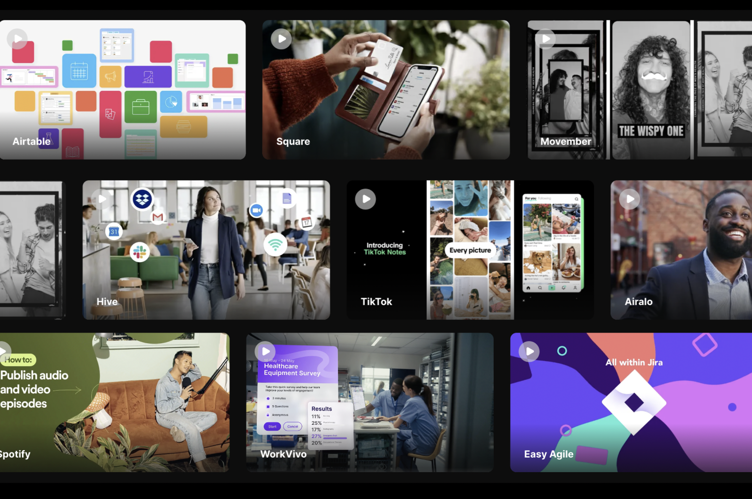
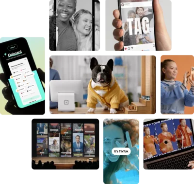
- We’ve proven it over 1200 times: our portfolio has been given a whole new look, with intuitive search to browse through our previous work.
- We’re strategic: through our content categories, there are so many different ways we can help when it comes to video. From customer acquisition, to engagement, to retention.
- We’re dynamic: we know how powerful video can be when it’s properly leveraged. Across localisations, A/B tests for messaging and cut-downs.
It was time to have a look that was consistent with these values, by refreshing key elements of our brand identity to illuminate and inspire.
We bring together world-class video talent, storytelling and technology to deliver clarity at scale. With an aim to be the most compelling commercial video company, in Australia. We have the team, the talent, and the brand to achieve that.
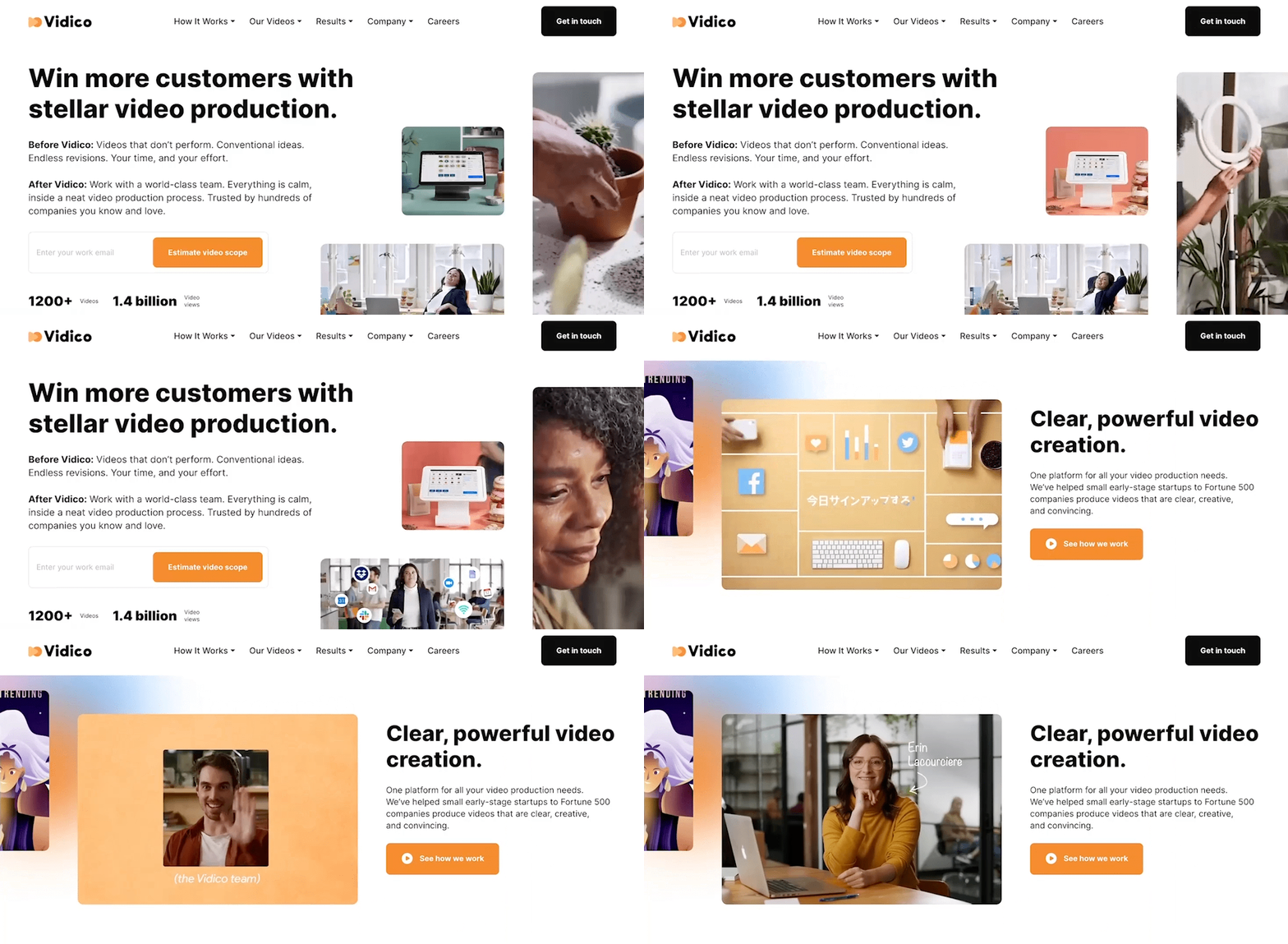
We have changed Vidico’s whole look. We’ve built a new website, created a new logo, changed our typeface, updated our gradient and colour palette, and refined our approach to layout and design for a better experience.
Introducing a new logo.
 In addition to our company name, our logo includes a play button and a sphere. The play button represents our relationship with video. The sphere represents an idea or a singular data point. Together, these shapes represent building blocks to creating something bigger!
Vibrant gradients and colours.
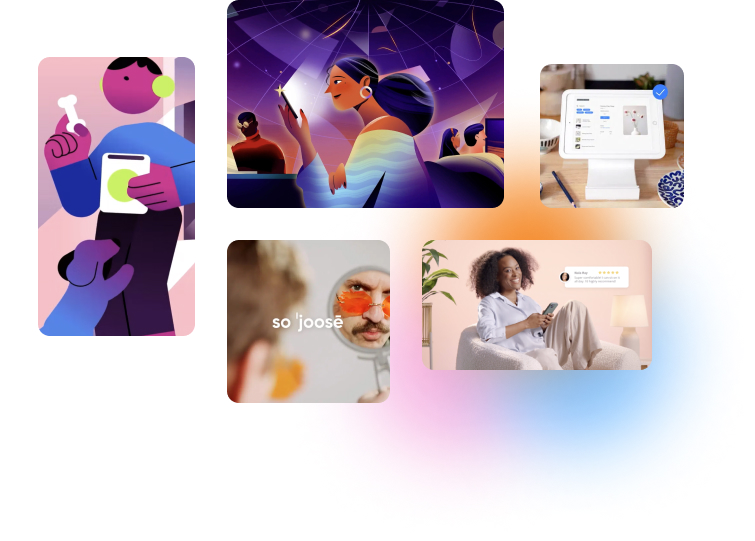
Vidico’s new colour palette is bright, vibrant and a reflection of the warmth our videos aim to achieve. These colours also form the foundation of our colourful orbs. They’re a boundless kaleidoscope of colour that has limitless potential.
A new typeface for more clarity.
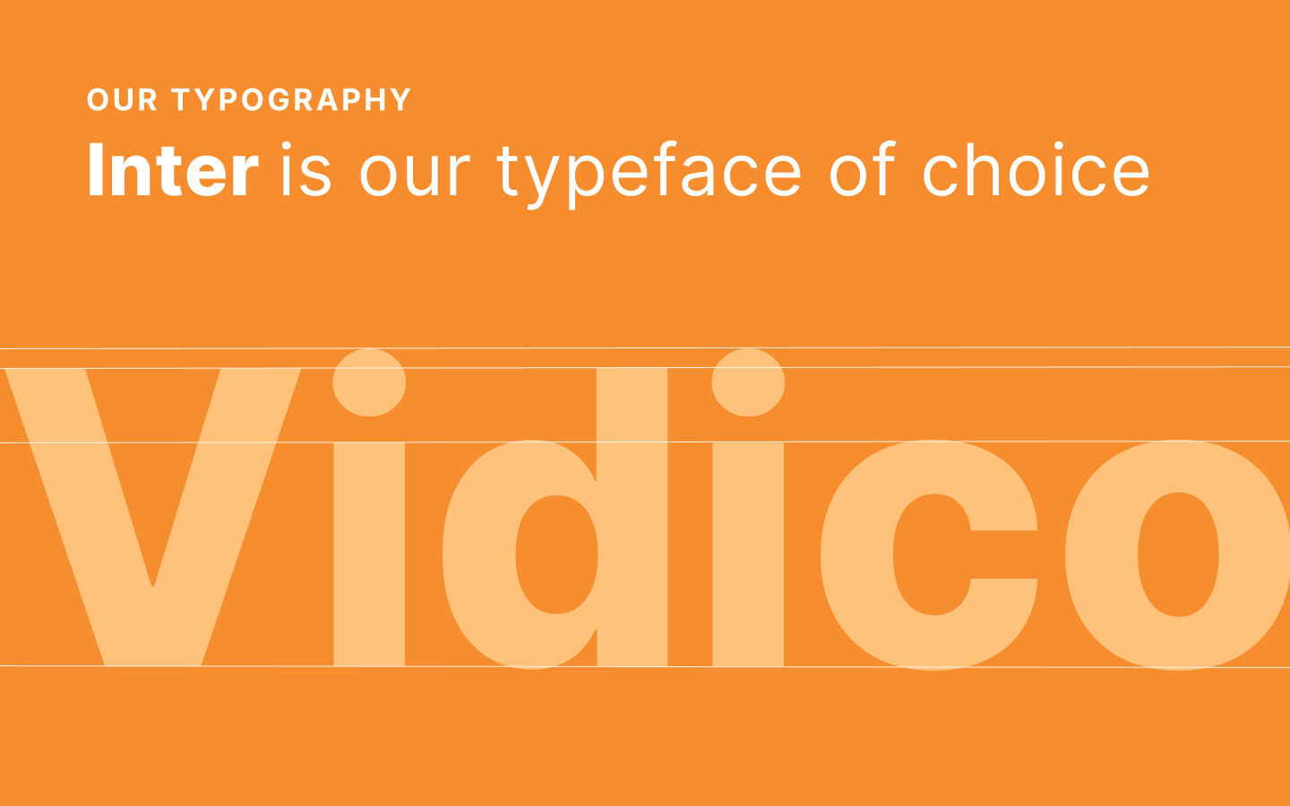
Inter is our typeface of choice across our website as well as our marketing campaigns. It’s specially designed for high legibility across small-to-large-sized screens. Every device and viewing platform is different and we need a typeface that’s able to communicate clearly across the diversity of screen sizes out there.
A design that puts your video needs first.
We put video content at the center, with a focus on simplicity to help you find the right type of video for your marketing goals as easier as possible. Everything was designed to seamlessly bring together all the different elements companies look for when they’re in need of video.
To learn more about how Vidico can help you win more customers start here — we hope you have a great experience exploring it.

