
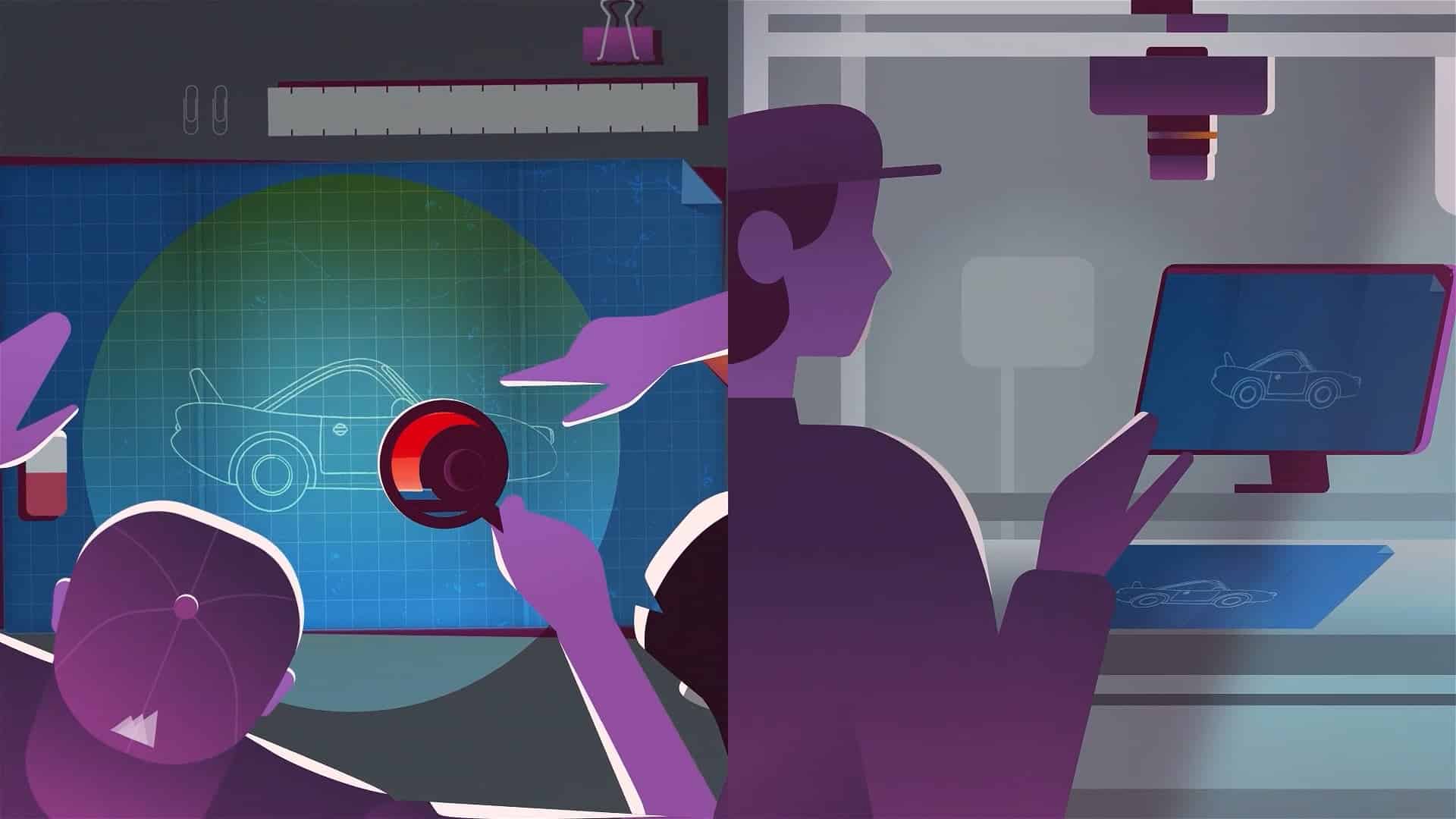
Simplify and abstract.
Instead of opting to use Homelight’s actual UI, the pace of the commercials demanded that we simplify each feature and function so that it wasn’t too overbearing or complex.
The designs were then abstracted, and made to interact with the live-action elements within the video: i.e a finger pressing a button.
The style we developed was then used as a shared asset between all five videos, where we created consistency through the use of constraints on colour, stroke width, and the number of layer groups in each scene.

Mixed-media.
Our principles for mixed media graphics really helped in creating a consistent graphic style. We’ve learned that:
1) You should always aim for a target for 2-3 colours across supporting graphics. Otherwise the graphics become overemphasised, and the colour theory ruins the set and costume design.
2) Photos shouldn’t be too colourful. The dominant colour within the photograph should match the graphics and either the main subject’s costuming, or a neutral black, grey or white.
3) Text should be made minimal where possible. If you need to represent text in UI, you can use a vector shape of a line — this is a good way to simplify text that can be overly distracting.

Homelight & Vidico
Here are some of the other graphics and animation we designed for the project:


Need a video?
where you need it most.
Typically takes 15 minutes
reply within 8-24 hours