This article was originally posted and written for SHIFT’s Cutaway, by Vidico’s Michael Pirone.
Our video production company produces 150 videos a year to help tech startups sell their product. As a first step, we ask each startup to complete a creative brief, with the last question requesting examples of how the company would like their video to look. For two years, the iconic Dollar Shave Club video was the most frequently sought-after style. Then came Sandwich’s What is Slack? For 2019, the company that’s been cited the most in our briefs is . . . Monday.com.
From a video-production perspective, Monday.com definitely knows what it’s doing. The company’s storytelling is excellent. It use resources wisely, and it has a keen editing sensibility that’s perfectly suited to the channels that feature the videos — all without a massive production budget.
These insights are important, because your startup can actually benefit from a similar approach to these core areas:
- Scripting and storytelling — The structure Monday.com uses and why it works
- Resource allocation — How to get good-looking results without breaking the bank
- Editing — How to best feature your product and how to create an exciting pace for your video
Each of the topics above will get its very own guide, across three separate articles. This initial piece will cover scripting and storytelling, where we chose Monday.com’s Teamwork Made Easy as our main reference.
“If you manage a team, you have to use Monday.com.”
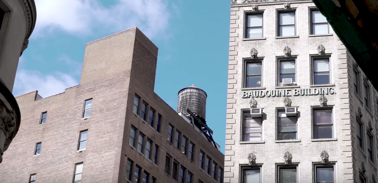
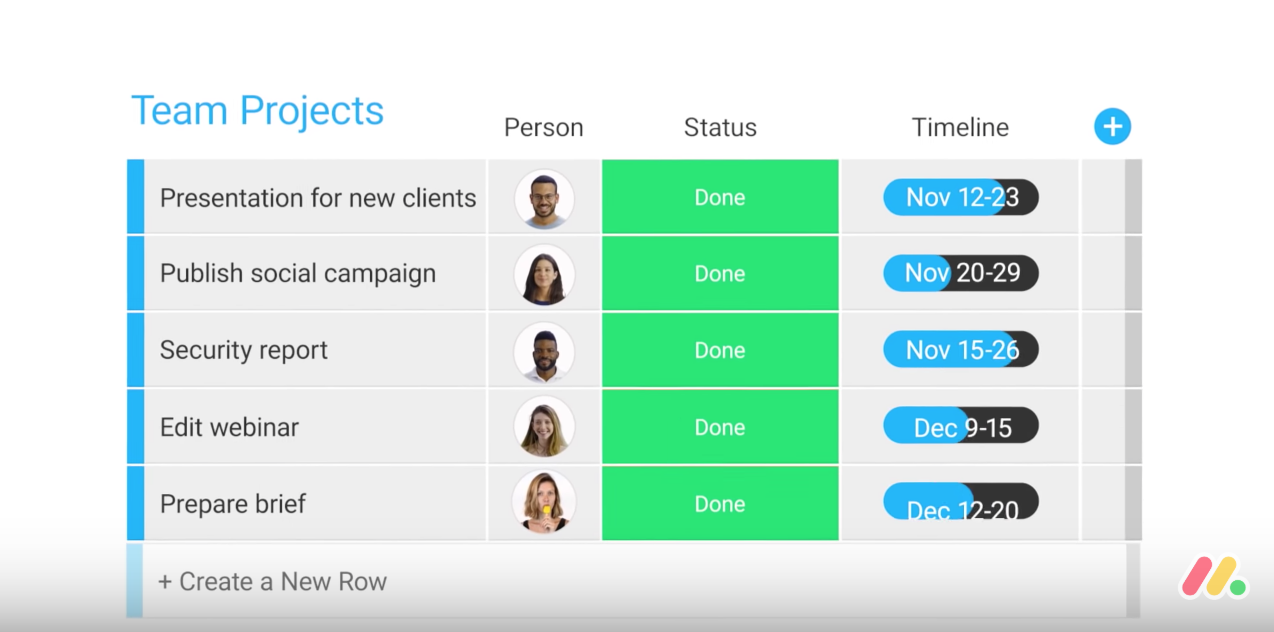
A simple opener that makes room for a broad business audience. Monday.com defines their market profile in literally three seconds by establishing shots of buildings and an office with an actual team in the background.
For all paid video ads, you’ll want your logo to appear in the first three seconds. Monday.com also gets this right by including its logo and by doubling with the company’s actual URL in the follow-up shot. Featuring the logo this early also means that, when there are skipped plays, Monday.com still manages to get inexpensive brand awareness. This technique was first popularized by Wix during the company’s extensive Youtube campaigns.
“Monday.com is a platform to track everything your team is working on.”
After setting up a broad audience and introducing its brand, Monday.com then nails a short one-liner about what its product actually does. We typically advise startups to repeat their company name within this one-liner, which is what Monday.com does — it might look like you’re doubling up in the script, but when read out loud, it sounds just fine.
“We use it for all our projects: marketing, product development, HR, creative production.”
Monday.com specifies market segments early on. If you have a product that’s similar in this regard, simply labelling your audience segments can have a big impact on overall engagement. Each market segment is supported with associated imagery, with “creative production” getting a really nicely timed montage of fabric and jewelry.
Like Monday.com, you should make sure that for every segment you list, you change the visual — This ensures that there’s no lack of context and that the hierarchy of each segment is balanced. We too used this device in our video for Square Online.
It’s worth noting that, at this point in the script, a more traditional route would’ve been to focus on a broader pain-point or problem. While mentioning the problem your product solves is most likely the safer route for your video’s success, it’s worth testing a few different lines on production day, giving you more flexibility in your final edits. You’ll also have the chance to run split tests to see which messages resonate best with your audience.
Monday.com actually used a similar strategy for this very project, where the company tested three different versions of the video above. You can watch the version that leads with the problem here.
“I love Monday.com because it’s totally customizable.”
Now we’re 15 seconds into the video, and we’ve moved from the introduction to the midsection. Here, it’s best practice to support your primary solution with three to four benefits. This is also the part of the video that focuses more on product and less on market profiles, which should’ve been strongly established by now.
While this point could be made for the line above, it’s only now apparent that the video is actually being framed as a testimonial, despite looking very much like it was made with Monday.com staff as the supporting talent. We see this as a growing trend that’ll continue into 2020, as it’s realistic enough to pass as a testimonial and structured enough to develop real credibility and engagement with audiences.
“And that’s something I couldn’t find in any other management tool.”
If you mention a problem after the 15-second mark, make sure you link it with a benefit to ensure the tone remains confident and in control. Monday.com gets a big tick for this.
“I can choose what information I want to track. Project owners, statuses, deadlines — which means, more time for actual work.”
When a feature is mentioned, Monday.com pairs it nicely with a benefit. Remember that advantages will always be more relatable to the audience. This is the second benefit that’s mentioned.
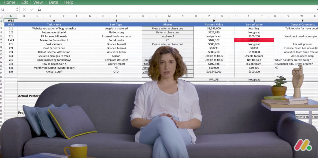
“I tried to manage everything we were doing with spreadsheets, and it was a nightmare.”
This is the only line that we would’ve moved to earlier in the video. It’s a strong visual that’s highly relatable, but it comes in at a slightly odd time. It’s not exactly paired with a benefit to make it immediately seem like the problem has been taken care of, though Monday is probably trying to make a visual comparison with their clean UI and the crudeness of an Excel spreadsheet.
“Now we have a tool that’s easy to use.”
Monday shows its logo a third time, which seems reasonable because this is a brand awareness video. If it was our decision, we would’ve either used an abstracted product UI or animated the UI next to the speaker to make a direct visual comparison to the clunkiness of Excel.
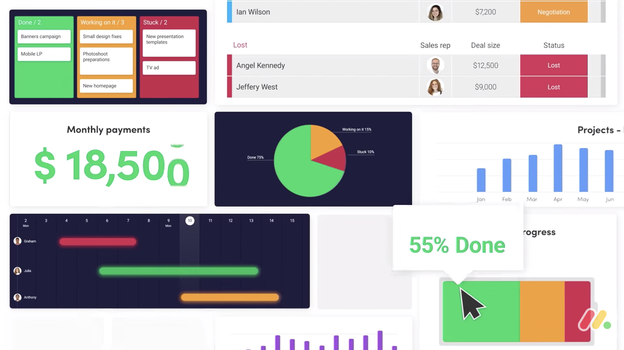
“There’s so much you can do — filter through data, get breakdowns of information, and see highlights from across departments.”
This is a textbook example of how to manage that feeling of “Our product can do so much more . . . and the audience really needs to know that.” Monday.com does the right thing by dedicating most of the video to a simple and high-level value proposition. If you want to include more features, a quick list in the final 10 seconds of the video closely implies that you didn’t get time to cover everything, which is almost the feeling you want to leave with the viewer. The features themselves are all represented within the same visual. You can either use UI as Monday.com has or a simple list that literally labels everything else your product can do.
“It gives a sense of everything falling into place.”
It’s important to dedicate one line to a positive feeling that the viewer should have when using your product. Feelings are more relatable than benefits and features. If you’re looking for an emotional or empathetic response, using the very words, “It gives a sense,” quickly ensures you have this area of your narrative covered. The power of that dialogue is also amplified when we see Monday.com’s team literally organizing themselves on the couch within the space of 1.5 seconds. It’s a strong visual and likely the most memorable from the entire video.

“Seriously, if you manage a team, you need to use Monday.com.”
Confidence plays a big part in whether a viewer will engage in a purchase, demo, or next step. Ensure that your narrator or talent absolutely nails this last line and get at least four to five different takes on the day to ensure that you’re using the very best resolution. You need to feel like the talent themselves are 100% invested in your product — with almost too much confidence.
Conclusion
Whilst the above isn’t the exact recipe for every single startup, it contains most of the elements needed for a stellar promotional video. This particular video was one of three that Monday.com used for its campaign and is currently sitting on 38 million (mostly paid) views. The second video has 5.7 million views, while the third has only 423,000 views. This tells us that, despite each having very similar production values, the above video was likely allocated a significantly increased ad spend based on its story and how well it initially engaged with audiences. There’s immense value in considering the overall structure of your story and the mechanics of how each component will resonate with your ideal customer.
______________
About Vidico
At Vidico, we produce a tonne of video content for seed and Series A startups that you’ve likely heard of or read about. If your in tech, chances are you’ve seen a startup video by Vidico.