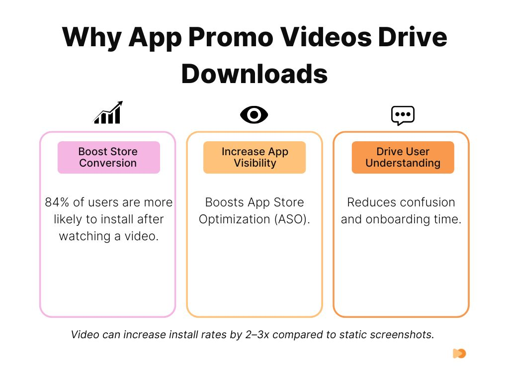
An app promo video is a short video, typically 30 to 90 seconds, that shows what your app does, why it matters, and convinces viewers to download it. The best app promo videos combine in-app footage, motion graphics, and benefit-first messaging to turn viewers into users. Industry research shows 77% of people have downloaded an app or software after watching a video about it.
With over 5 million apps competing across the App Store and Google Play, your app needs more than screenshots to stand out. App preview videos boost store conversion rates by 20-40% compared to screenshots alone, and short-form videos between 30 and 60 seconds are the most effective format for driving installs.
As a B2B explainer video company, we have produced over 2,000 video campaigns, generating 1.5 billion views for brands including Square, Digital Ocean, and Airtable. In this guide, we break down the best app promo video examples, what makes them work from a production standpoint, how much they cost, and how to create one that drives downloads.
Key Takeaways
- App preview videos boost store conversion rates by 20-40% compared to screenshots alone
- Professional app promo videos cost $2,000 to $15,000+ depending on style, with screen recordings starting at $400
- The first 3 seconds determine 71% of viewer retention, so lead with the core value immediately
- Short-form videos (30-60 seconds) perform best for app store listings and social promotion
- 77% of people have downloaded an app after watching a video about it
- Over 80% of mobile video is watched on mute, so captions and on-screen text are mandatory
- Vertical video formats outperform horizontal on mobile platforms and in-feed placements
Content
Best App Promo Video Examples
1. Digital Ocean App Platform (Vidico)
Watch the Digital Ocean App Platform video on our case studies page.
Digital Ocean’s app platform explainer video demonstrates how to promote a complex technical product without overwhelming the viewer. The 60-second animated explainer uses clean UI mockups layered with motion graphics to walk through the platform’s deploy-in-seconds workflow. It opens with the developer’s pain point (managing infrastructure) and shows the solution within the first 5 seconds.
What makes it work: The video uses a progression structure. It starts with a single code deployment, then zooms out to show scaling, monitoring, and team collaboration. This mirrors how developers actually discover the product. No voiceover jargon. Every screen shown is a real interface element. The animation smoothly transitions between features without cutting away to stock footage or abstract graphics.
Results: 3.7 million YouTube views and a measurable reduction in cost per acquisition. The video became Digital Ocean’s primary top-of-funnel asset for the App Platform launch.
Get a free Creative Brief Template to plan your own app promo video.
2. Duolingo: Gamified Education
Duolingo’s “Duolingo Push” promo takes a completely different approach. Instead of showing the app interface, it leans into comedy and brand personality. The video features their owl mascot showing up in real life to remind users to complete their lessons. It uses live-action production with the animated character composited in, creating a memorable hybrid format.
What makes it work: The hook is immediate. The video opens with a jarring, unexpected scenario that stops the scroll. Duolingo understands their audience watches on social media first, so they built the video for shareability rather than feature demonstration. The app itself appears only briefly at the end with a clear download CTA. This approach works because Duolingo’s brand awareness is already high. They need engagement, not explanation. As of Q1 2026, Duolingo has over 116 million monthly active users, and their video-first social strategy played a significant role in that growth.
Key takeaway: If your app has strong brand recognition, lead with entertainment and personality instead of features. The video itself becomes the marketing.
3. Uber: Simplicity First
Uber’s rider app promo video is a masterclass in showing, not telling. The entire video follows a single user journey from opening the app to arriving at the destination. No voiceover. No text overlays. Just clean screen recordings of the actual interface with smooth transitions between each step.
What makes it work: The production uses a split-frame technique where real-world footage occupies the top half while the app interface fills the bottom. This side-by-side approach connects each digital action to its physical outcome without needing narration to explain the link. The screen recordings use a shallow depth-of-field effect on the phone mock-up, keeping attention on the active UI element. Transitions between steps use a match-cut editing style where the map animation in the app dissolves into the real street. The color grade stays warm and slightly desaturated, matching the modern-neutral aesthetic that was standard for Silicon Valley brands in this era.
Key takeaway: For utility apps with straightforward workflows, let the interface speak for itself. Use split-frame or picture-in-picture to connect digital actions to real-world outcomes.
4. Slack: Workplace Productivity
Slack’s “Work, simplified” video uses split-screen animations to contrast chaotic workplace communication (scattered emails, missed messages, lost files) with Slack’s organized channel-based approach. It is a 60-second animated explainer that uses geometric shapes and bold colors rather than realistic UI screenshots.
What makes it work: The problem-solution structure is compressed into the first 10 seconds. You see the mess, then you see the fix. Slack avoids the trap of listing features. Instead, it shows outcomes: “conversations organized by topic,” “files searchable in one place,” “integrations with tools you already use.” Each claim maps to a visual that takes less than 3 seconds to absorb. The animation style is distinctive enough to be recognizable as Slack without showing a single screenshot. Slack has grown to over 40 million daily active users by 2026, and their video strategy consistently prioritizes clarity over feature density.
Get a free competitive analysis of your current video strategy with our Creative Intelligence Report.
5. Headspace: Calm and Clarity
Headspace’s app promo mirrors the experience of using the product. Soft colors, slow animations, and a gentle pace create the same feeling of calm that the meditation app delivers. The video walks through the app interface with guided narration explaining each section, exactly like a first-time user tutorial.
What makes it work: The production style IS the product pitch. A fast-paced, high-energy video would contradict Headspace’s entire brand promise. The video uses authentic in-app footage showing real screens, real meditation timers, and real progress tracking. This builds trust because viewers see exactly what they will get after downloading. The narration uses second-person language (“you’ll see your progress here”) which creates an intimate, coaching tone. With over 70 million users across 190 countries, Headspace proves that matching your video’s energy to your product’s energy is more important than following trends.
Key takeaway: Your video’s pacing, color palette, and audio should match the emotional experience your app delivers. If your app calms people down, your promo video should too.
6. Airbnb: Aspiration and Experience
Airbnb’s promo video barely shows the app interface at all. Instead, it uses cinematic footage of unique stays, beautiful destinations, and authentic guest experiences. The app appears only in brief cutaway shots showing the booking flow.
What makes it work: The production uses handheld camera work with natural lighting to create a documentary feel that separates it from the polished, studio-shot style of hotel commercials. The edit alternates between wide establishing shots of locations and tight close-ups of details (textures, food, hands opening doors) at a 2:1 ratio. The color grading uses lifted shadows and warm highlights to give every location a golden-hour quality. Sound design layers ambient room tone and location audio under the music track, which creates an immersive feel. The app UI appears for only 8-10 seconds total in a 60-second spot, always as a brief cutaway rather than a sustained demo. This ratio (85% lifestyle, 15% product) works because the booking interface is not what differentiates Airbnb.
Key takeaway: For marketplace and experience apps, invest in cinematic production that sells the outcome. Use handheld camera, natural light, and ambient audio to create emotional authenticity.
Find out what your app promo video would cost. Take the VidiFit Quiz for an instant estimate.
7. TikTok: User-Generated Creativity
TikTok’s promo video is built entirely from user-generated content. The video showcases a rapid montage of creative, funny, and inspiring clips made by actual TikTok users. The editing pace mirrors the app experience, with quick cuts and full-screen vertical compositions.
What makes it work: The best demonstration of a content creation platform is the content itself. TikTok does not need to explain features because the UGC speaks for itself. The montage format shows the breadth of content types (comedy, dance, education, cooking, art) in under 60 seconds, appealing to multiple audience segments simultaneously. The production adds minimal overlays, letting the raw content carry the message.
We worked with TikTok to drive 1 million organic views in 5 days through strategic video assets. As their Global Head of Publisher Development noted: “Vidico consistently delivers high-quality results, quickly, reliably, and at a fair price.”
8. Instagram: Visual Storytelling
Instagram’s “We Are In The Making” promo uses a documentary-style approach, featuring real creators talking about how the platform enables their creative work. It blends user testimonials with polished cinematography and quick cuts of the app’s creative tools in action.
What makes it work: The editing drives this video. Quick cuts average 1.5 seconds per shot, creating a rhythm that mirrors the experience of scrolling through a feed. The production mixes three visual layers: handheld creator interviews shot on anamorphic lenses with shallow depth of field, screen captures of the actual app interface with smooth scroll animations, and stylized product shots of phones displaying finished content. The color palette shifts between warm and cool tones as it moves between creators, giving each segment its own visual identity while staying cohesive. The typography uses Instagram’s custom sans-serif font for text overlays, reinforcing brand recognition without a logo lockup. The pace accelerates from 2-second cuts to sub-second cuts in the final 15 seconds, building momentum toward the closing CTA. Instagram reached over 3 billion monthly active users in 2025.
9. Spotify: Personalization and Discovery
Spotify’s promotional campaigns center on their signature feature: personalization. The annual Wrapped campaign and “Discover Weekly” feature videos use data visualization and dynamic typography to show how the algorithm understands each listener.
What makes it work: The production technique that defines Spotify’s promo approach is dynamic data visualization. Bold sans-serif typography renders listening stats as full-screen animated text, with each number growing, shifting, and transforming using kinetic typography principles. The color palette uses Spotify’s duotone gradient system, applying neon greens, purples, and pinks in gradients that shift based on genre. The Wrapped videos use a vertical-first format (9:16) built for Instagram Stories and TikTok sharing, with each stat card holding for exactly 3 seconds, matching the optimal swipe pace for Stories. No voice narration. All meaning comes from typography, color, and motion graphics. This design-led approach makes each video instantly recognizable as Spotify without showing a single frame of the app interface. With 675 million monthly active users as of Q3 2025, this format has become a benchmark for app marketing.
Key takeaway: If your app generates personalized data, use kinetic typography and bold color systems to turn that data into shareable, vertical-first video content.
Ready to create your own app promo video? Book a free strategy session and get expert creative direction.
Also read: Best Mobile App Promo Video Examples in Australia
10. Evernote: Productivity and Organization
Evernote’s app relaunch video takes a product-demo approach, walking viewers through the redesigned interface with clean screen recordings and subtle motion graphics highlighting new features. The video opens with “The new Evernote is here,” establishing immediacy and positioning this as an upgrade worth revisiting.
What makes it work: For productivity apps with established user bases, the relaunch format works well. Existing users want to see what changed. New users want to understand why this version is worth trying. Evernote’s video covers both audiences by showing familiar features with a fresh design. The pacing is methodical, giving each feature enough screen time to be understood. Cross-platform functionality (phone, tablet, desktop) is demonstrated through smooth device transitions. With over 200 million registered users, the relaunch video needed to reassure existing users while attracting new ones.
11. Google Maps: Utility and Exploration
Google Maps’ promo video balances two user needs: functional navigation and discovery. The video alternates between someone navigating a route and discovering hidden restaurants, parks, and local events.
What makes it work: The production uses augmented reality compositing to overlay map data onto real-world footage in real time. Blue route lines appear on physical streets, pins drop onto actual storefronts, and star ratings float above restaurant facades. This AR integration is achieved through tracking shots where the camera follows a walking POV while the VFX team composites map UI elements that stick to real-world surfaces. The editing uses a point-of-view camera angle for navigation sequences (first-person walking perspective) and switches to wide establishing shots for discovery moments. Sound design adds subtle digital chirps and haptic feedback sounds when map elements appear, bridging the digital and physical worlds. The pacing is deliberately slower than most app promos, averaging 3-4 seconds per shot, which matches the careful, exploratory pace of someone navigating a new area. Google Maps serves over 2 billion monthly users worldwide.
What Makes an Effective App Promo Video
Hook Viewers in the First 3 Seconds
The first 3 seconds determine whether someone keeps watching or scrolls past. Research shows this window accounts for 71% of overall viewer retention. Open with your strongest visual, a surprising statement, or the core problem your app solves. Never start with a logo animation or company introduction.
Show the App in Action
Screen recordings and UI demonstrations build trust because viewers see exactly what they will get. Use actual app footage rather than mockups when possible. Highlight the key workflow, not every feature. The best app explainer videos focus on one primary use case and complete it from start to finish.
Lead with Benefits, Not Features
“Organize your notes across all devices” is a feature. “Never lose an idea again” is a benefit. Every frame in your promo video should answer the viewer’s question: “What does this do for me?” Connect each feature demonstration to a real outcome the user cares about.
End with a Clear Call to Action
Every app promo video needs a direct next step. For App Store and Google Play listings, the CTA is built in (the download button). For social and website placements, add an explicit CTA: “Download free on the App Store,” “Start your free trial,” or “Available on iOS and Android.” Include the relevant store badges as an end frame.
App Promo Video Cost Breakdown
Professional app promo video production ranges from $400 for simple screen recordings to $15,000+ for full live-action and animation campaigns. The right investment depends on where you are using the video and what action you need viewers to take.
| Video Type | Price Range | Best For | Timeline |
|---|---|---|---|
| Screen Recording + Annotations | $400-$1,500 | Simple app demos, tutorials | 1-2 weeks |
| Whiteboard Explainer | $600-$2,500 | Problem/solution narratives, onboarding | 2-3 weeks |
| Animated UI Mockup | $800-$3,000 | Feature walkthroughs, app navigation | 2-3 weeks |
| 2D Character Animation | $2,000-$5,000 | Storytelling, emotional connection | 3-4 weeks |
| Motion Graphics | $2,500-$7,000 | Brand launches, premium positioning | 3-5 weeks |
| Live-Action + Animation | $5,000-$15,000+ | Major launches, brand campaigns | 4-8 weeks |
| 3D Product Visualization | $4,000-$10,000+ | Premium apps, complex products | 4-6 weeks |
Hidden costs to budget for:
- Music licensing ($100-$500+)
- Voiceover talent ($200-$1,000+)
- Platform-specific format conversions (15-30% additional)
- Localization per market ($500-$2,000 per language)
- Revision cycles beyond initial scope
DIY options: Tools like Canva, Renderforest, and InVideo offer template-based app promo video creation starting at $0-$30/month. These work for basic screen recording demos and simple animated walkthroughs. They fall short when you need custom animation, brand-specific design systems, or production that stands out against competitors with professional video.
Our approach uses reusable template systems that reduce ongoing production costs by 30-40%. One production session yields multiple assets optimized for App Store, Google Play, social media, and paid campaigns. As a B2B explainer video company with 920+ clients, we have built this system across 2,000+ campaigns.
Get expert creative direction for your app promo video. Talk to our team about your project.
FAQs
How long should a mobile app promo video be?
For App Store previews, Apple limits videos to 15-30 seconds. Google Play allows up to 30 seconds (down from 2 minutes as of their 2024 policy update). For social media and website use, 30-60 seconds is the sweet spot. According to the 2025 State of Video Marketing report, 39% of marketers find videos between 30-60 seconds most effective. Show your core value proposition within the first 5 seconds regardless of total length.
What platforms should I use to share my app promo video?
App Store and Google Play listings are the priority since they directly influence download conversion. Beyond app stores, use YouTube for discoverability, Instagram Reels and TikTok for short-form reach, LinkedIn for B2B apps, and paid campaigns across Meta and Google for targeted distribution. Each platform needs format adjustments.
Do I need different versions of my app promo video for each platform?
Yes. Apple requires authentic in-app footage with strict limitations on overlays and promotional content. Google Play allows more creative freedom including CTAs and promotional messaging. For social media, vertical (9:16) formats outperform horizontal on Instagram Stories, TikTok, and YouTube Shorts. Horizontal (16:9) works best for YouTube and website embeds. Always add captions since over 80% of mobile video is watched on mute.
What’s the ROI on app promo videos?
Apps with well-optimized preview videos see 20-40% higher conversion rates compared to screenshots alone. According to the 2025 State of Video Marketing report, 77% of consumers say they have downloaded an app after watching a video. The ROI is typically visible within 30-60 days of launch and compounds over time as the video drives organic discovery through App Store and Google Play algorithms.
Should I use animation or live-action for my app promo video?
Animation works best for SaaS, fintech, and apps with complex features that benefit from visual simplification. Live-action creates emotional connection for lifestyle, fitness, and consumer apps. Many successful app promos combine both, using animated UI demonstrations with live-action user scenarios. According to the 2025 State of Video Marketing report, 91% of people watch explainer videos to learn about products, making animated explainers the most versatile format.
How do app preview videos impact ASO (App Store Optimization)?
App preview videos directly impact conversion rates, which is a ranking signal for both app stores. Videos keep users on your listing longer, reduce uninstall rates by setting accurate expectations, and improve post-download retention. Apple’s Product Page Optimization (PPO) feature lets you A/B test different video versions to optimize performance. Google Play Experiments offers similar split-testing capabilities.
What mistakes should I avoid in app promo videos?
The biggest mistake is creating overhyped videos that do not match the actual app experience. This leads to negative reviews and high uninstall rates. Other common errors include burying the value proposition after a long intro, using the same video for App Store and Google Play (different requirements and formats), skipping captions for sound-off viewing, and not testing variations. Always show real app footage rather than polished mockups that set unrealistic expectations.
Conclusion
The best app promo videos share common traits: they hook attention in the first 3 seconds, show the app solving a real problem, and end with a clear next step. Whether you choose animation, live-action, or a hybrid approach, the format should match your audience and platform.
For startups and growing companies, DIY tools can produce basic demos to validate your messaging. For brands launching to competitive markets or running paid campaigns, professional production delivers the quality and strategic thinking that separates high-converting videos from background noise.
As a B2B explainer video company, we have helped brands like Square produce 200+ video assets per month and helped Digital Ocean’s App Platform video reach 3.7 million views. Our reusable template systems make ongoing production faster and more cost-effective with every campaign.
Book a free strategy session and get expert creative direction for your project.