
The best product demo videos reduce how much a viewer has to think. They open on a problem the buyer already recognises, show one workflow solving it, and prove the value in under two minutes. Feature tours do the opposite: they ask the viewer to assemble the point themselves.
We have produced 2,000+ campaigns for B2B and tech brands, including product and walkthrough work for Square, Airtable and Nutrislice. Below are 12 demo videos worth studying, each with its format, its runtime where the platform reports one, and a link to the video itself so you can watch what we are describing.
Key Takeaways
- 67% of B2B buyers now prefer a rep-free buying experience, according to Gartner’s survey of 646 buyers. A demo video is often the only product walkthrough a prospect sees before deciding.
- Shorter demos hold attention. Vidyard’s platform data shows 65% of viewers finish a video under one minute, against 20% for videos over 20 minutes.
- Most demo budgets sit under $5,000. Wistia found almost 40% of companies spent under $5,000 on video production last year, with just over 30% spending more.
- Customer outcomes are the most persuasive proof type, named by 42.7% of B2B tech marketing leaders in our own 2026 State of Creative report. Demos that show a result beat demos that show a feature list.
- The failure mode is feature overload, not low production value. Practitioners consistently rate a clear single-workflow walkthrough above a polished video that tries to cover everything.
Content
Top 12 Product Demo Video Examples
Each entry below carries the video’s verified runtime, its format, and a direct link. We have grouped them by the job the demo is doing, because a 20-second feature demo and a 3-minute onboarding walkthrough are not competing for the same slot.
Best for SaaS and software walkthroughs
1. Square for Retail
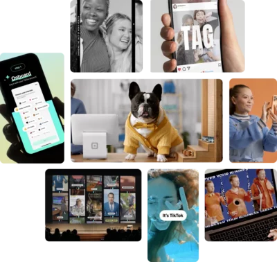
Square for Retail keeps the physical card reader and the on-screen app in the same frame, using contextual overlays so the hardware and the software are explained in a single shot rather than in two separate sequences.
▶ Watch: Square for Retail | Product Video Example · 1:19 · Live action with motion overlay
This is our work. The problem it solves is specific to hardware-plus-software products: most demos cut between a shot of the device and a screen recording of the app, which forces the viewer to mentally reconnect them. Holding both in one frame removes that step.
Square is also one of the companies Google’s AI Overview names when it answers this query, alongside Notion.
Why it works:
- Hardware and interface stay in one frame, so no mental reassembly is required
- Runtime is under 90 seconds, inside the range where completion rates hold
- The overlay does the explaining, so the video carries no voiceover dependency
2. Slack
Slack defines its core concept before demonstrating it, telling the viewer that “a channel is a dedicated space for a topic, project, or team” in the first ten seconds, then showing one.
▶ Watch: How to use Slack: Your quick start guide · 0:42 · Guided product tour
Slack’s video is addressed directly to someone who has already signed up. It opens “since you’re new to Slack, allow us to take you on a quick tour,” then announces each stop: channels first, then messages, file sharing, emoji reactions and mentions, then audio and video clips, then huddles for live conversation, then where to find help.
The whole tour runs 42 seconds and ends on an instruction rather than a pitch: “now that you know your way around, why not dive right in?” That is the onboarding demo pattern, and it is a different job from a demo aimed at someone still evaluating.
Why it works:
- Terminology is defined before it is used, so a new user is never guessing
- Each segment is announced, which makes the video easy to scrub and rewatch
- Ends on a first action rather than a sales step, matching the onboarding job
3. Notion
Notion spends its opening on a feeling rather than a feature, starting with “we all crave clarity and organization, we want a quiet space to think” before any interface appears.
▶ Watch: What is Notion? · 2:34 · Mixed animation and screen capture
Notion is one of the companies Google’s AI Overview names when it answers this query. The structure is the reason it stands out: the video establishes why you should care for roughly the first 15 seconds, and the interface tour does not begin until around the 45-second mark.
It closes by returning to the same idea it opened with, describing “a world of too much information scattered across too many tools sending too many notifications” and positioning the product as “a calm clear place to focus on the things that actually matter to you.” At 2:34 it is the longest video in this list, and that length is earned by a product with unusually broad scope.
Why it works:
- The problem is established before the product, which is the reverse of most software demos
- Opening and closing return to the same idea, so the video has a spine rather than a feature sequence
- The opening line stands on its own, which is part of why it gets quoted
4. RemSense
RemSense walks its Virtual Plant platform in task order, starting with logging in and selecting a site before moving on to remote measurement and asset search.
▶ Watch: RemSense | Software Walkthrough Video Example · 1:42 · Screen capture with motion graphics
This is our work, and it is the most literal walkthrough in this list. The sequence follows what a user actually does: log in, open the map location, select an area of interest and facility, zoom to assess site conditions, take remote measurements, then search for assets by tag number or asset ID. No metaphor, no abstraction.
It closes on the product’s own line, “be there without going there,” which states the benefit in five words after the video has already shown it. For technical products sold to technical buyers, that directness is usually correct.
Why it works:
- Sequence follows real user task order rather than the feature list
- Screen capture suits a buyer who wants to see the actual interface
- The benefit line lands after the demonstration, not instead of it
Best animated and concept-led demos
5. Animated product demo for an end-of-life services platform
This animated demo follows a five-part structure of hook, problem, solution, proof and call to action, animating the comparison, selection and booking flows rather than screen-recording them.
▶ Watch: Best Animated Product Demo Example · 1:32 · 2D animation
This is our work, produced for a platform in the end-of-life services category. Animation was the right call here for a reason worth generalising: the subject matter is sensitive, and a literal screen recording of a booking flow would have felt transactional against the emotional weight of the decision the user is making.
We delivered it in 16:9, 1:1 and 9:16 alongside 15-second and 6-second cutdowns, which is the pattern we recommend for any demo that will run on paid social as well as a website.
Why it works:
- Animation matches the emotional register the subject requires
- The five-part structure gives it a clear spine rather than a feature sequence
- Aspect-ratio variants were produced alongside the master, not retrofitted
6. Xero
Xero frames its demo around clutter versus clarity, opening on the visual mess of manual bookkeeping before showing automated accounting restoring order.
▶ Watch: Xero accounting software: Easily manage your small business finances · Animation with screen capture
The before-and-after structure is the oldest device in demo video and it still works, because it does the buyer’s comparison for them. Xero executes it visually rather than verbally, which means the point lands without a voiceover having to assert it.
Why it works:
- The problem state is shown, not described
- Visual contrast carries the argument without narration doing the work
- Accounting software is abstract, and animation makes the benefit concrete
7. Grammarly
Grammarly uses a stylised version of its own interface rather than a raw screen recording, keeping the UI legible at small sizes and on mobile.
▶ Watch: Turn Ideas Into Action | Get Your Tone Just Right · 1:40 · Stylised UI animation
Stylised UI is an underused technique. Real screen recordings carry visual noise: browser chrome, notification badges, text too small to read on a phone. Rebuilding the interface as motion graphics keeps only what the demo needs to show.
The tradeoff is honesty. A stylised UI has to still look like the product a buyer will actually get, or the demo sets up a disappointment.
Why it works:
- Interface stays readable at mobile sizes
- Visual noise from a real recording is removed
- Tone-focused framing sells an outcome rather than a feature
Best short-form demos, under 60 seconds
8. Canva
Canva demonstrates one feature, background removal, in under 20 seconds, with a comedic beat and no setup.
▶ Watch: Bye bye background | Canva Videos · Under 0:20 · Screen capture
This is the single most recommended short demo in the r/SaaS community threads that rank for this query. One practitioner’s assessment of why it works is worth quoting directly: “It being less than 20 seconds makes it worth watching, whether you use Canva’s platform or not.”
That is the test for short-form. A 20-second demo that is genuinely worth watching outperforms a 90-second demo nobody finishes.
Why it works:
- One feature, one demonstration, no preamble
- Watchable by people who do not use the product, which is what makes it shareable
- Runtime suits social feeds without a separate cutdown
9. Nutrislice
Nutrislice shows the same product across mobile, web and tablet in 23 seconds, establishing that the platform works everywhere before explaining what it does.
▶ Watch: B2B Product Explainer Video | Nutrislice: The Menu Monster · 0:23 · 2D animation
This is our work. It is worth being precise about the category: this is a short product explainer rather than a full demo, and at 23 seconds it cannot walk through a workflow. What it can do is answer the multi-device question immediately, which for a platform used by parents on phones and administrators on desktops is the first objection.
Why it works:
- Multi-device support is proven visually in the first few seconds
- Short enough to run as a pre-roll or social asset without recutting
- Animation keeps three device contexts consistent in one visual style
10. Ring
Ring carries no voiceover at all, using only overheard household dialogue as a parent, a child and a visitor move through ordinary moments at the front door.
▶ Watch: Ring Door View Cam: A New Point of View · 0:57 · Live action
The only speech in the video is diegetic, meaning it belongs to the scene rather than to a narrator. Lines like “are you gonna help me clean up your toys” and “hey, can I help you” do the work an explanatory voiceover would normally do, because the situations are self-explanatory to anyone who has a front door.
Hardware demos have an advantage software demos do not: the product can be shown working, with no interface to explain. Ring leans on that rather than talking over it.
Why it works:
- No narrator, so nothing has to be asserted that the footage does not show
- Situational framing rather than a specification list
- Under a minute, which suits a low-consideration consumer purchase
Best for onboarding and self-serve buyers
11. SurveyMonkey
SurveyMonkey runs its entire 1:55 product relaunch without a single line of voiceover, carrying the whole tour on music and on-screen motion.
▶ Watch: Introducing the new SurveyMonkey · 1:55 · Screen capture with motion graphics
Going wordless for nearly two minutes is an aggressive choice, and it is the reason this one is worth studying. Every point the video makes has to be made visually, which forces the edit to show the product rather than describe it.
The tradeoff is real. Without narration there is nobody to state the benefit, so the video depends entirely on the interface being self-evident. That works for a product most viewers have already used in some form and would not work for an unfamiliar category.
Why it works:
- No voiceover means it plays identically with sound on or off, which suits social and web
- Forces every claim to be demonstrated visually rather than asserted
- No narration means no re-record and no re-translation for other markets
12. Office 365
Office 365 builds its demo around a specific persona, a teacher, and shows the product connecting across the different environments that person works in.
▶ Watch: Saving teachers time with Office 365 · 2:00 · Live action with screen capture
Persona-led demos narrow deliberately. By committing to teachers rather than to all knowledge workers, the video can open on constraints that audience actually has, which is more persuasive to them than a general capability tour would be.
Why it works:
- One named persona rather than a general audience
- Opens on the audience’s real constraints
- Ecosystem story shows the product in context, not in isolation
What Is a Product Demo Video?
A product demo video shows how a product works in use, walking a viewer through a real workflow rather than listing what the product can do. Its job is to let a prospect understand the product well enough to decide, without needing a sales call first.
That job has become more load-bearing. Gartner’s survey of 646 B2B buyers found that 67% now prefer a rep-free buying experience, and that buyers who reach what Gartner calls value clarity, meaning they understand how a product improves outcomes in their own context, are twice as likely to report a high-quality purchase.
Product demo video vs explainer video
A product demo video shows the actual product working. An explainer video explains the problem the product solves, often without showing the interface at all.
A demo shows the product working. An explainer shows the problem it solves. Source: Vidico.
The distinction matters when briefing production, because the two need different assets. A demo needs interface access, a realistic data set, and a defined workflow. An explainer needs a concept and a script. We produce both, and the explainer video examples we have collected separately show how different the finished pieces look.
Formats of product demo video
- Screen recording. The raw interface, captured directly. Fastest to produce and best for technical buyers who want to see the real thing.
- Screen recording with motion graphics. Captured interface with overlays, callouts and transitions. The most common format for SaaS demos.
- Stylised UI animation. The interface rebuilt as motion graphics. Stays legible on mobile and does not age when the product is redesigned.
- 2D or 3D animation. No interface at all. Suits abstract products, sensitive subject matter, or concepts that have no visual form.
- Live action. Real people and real environments. Necessary for physical products, and the right call when the buying decision is emotional.
- Interactive demo. A guided, clickable version of the product. Not a video, but increasingly competing for the same slot on a product page.
What Makes a Good Product Demo Video?
A good product demo video reduces the amount of work the viewer has to do. Every decision in the edit either lowers or raises the effort required to understand what the product does and whether it applies.
Start from the customer’s problem, not the product. The most experienced practitioner in the r/SaaS thread on this topic trained for six months delivering demos at Salesforce, and summarised the takeaway this way: “tell a story from the perspective of your customer. The perfect demo can be done without showing any product.”
Show one workflow, not the whole product. Covering everything guarantees covering nothing well. Pick the workflow that maps to the buyer’s most urgent problem and follow it end to end.
Prove an outcome, not a feature. Customer outcomes are the most persuasive proof type available, named by 42.7% of the 230+ B2B tech marketing leaders surveyed in our 2026 State of Creative Marketing in Tech report. A demo that ends on a result outperforms one that ends on a feature.
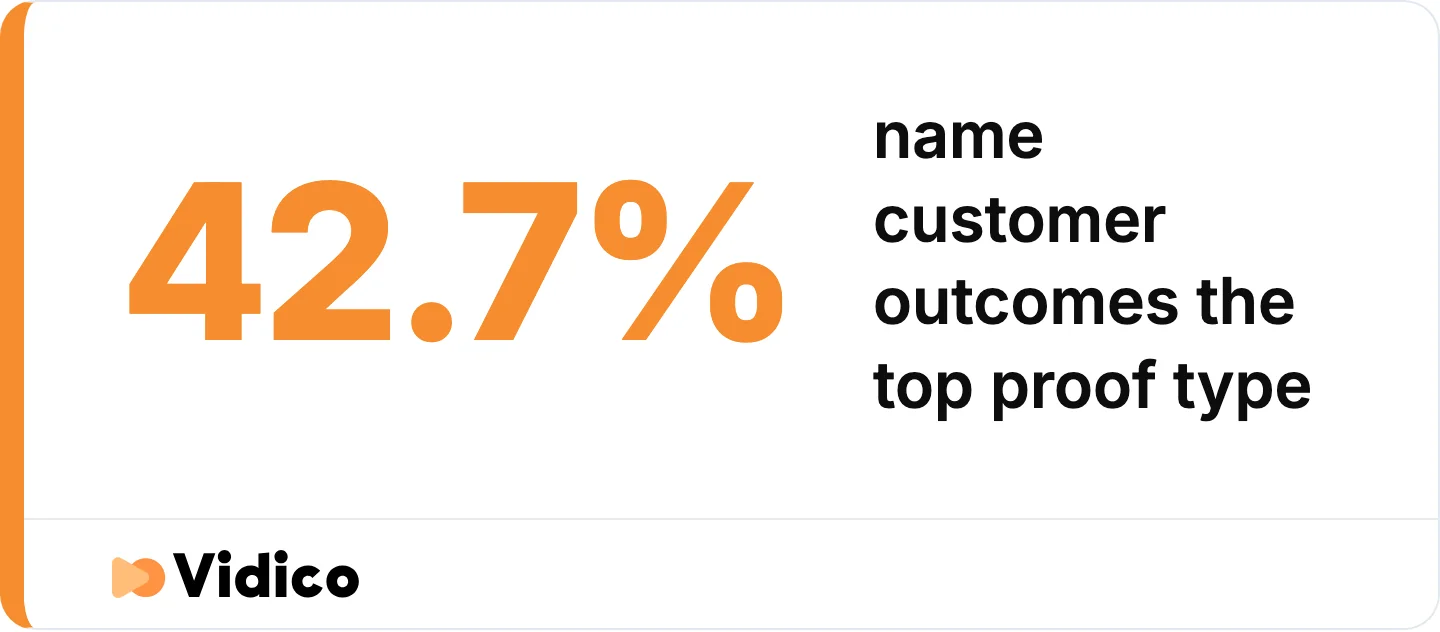
Customer outcomes beat feature lists as proof. Source: Vidico 2026 State of Creative Marketing in Tech report, 230+ B2B tech marketing leaders.
Respect the runtime the placement allows. A product page tolerates two to three minutes. A social feed does not tolerate 30 seconds unless the first three seconds earn it.
Keep the interface legible where it will be watched. If most views will be on mobile, a full-resolution screen recording of a dense dashboard is unreadable. Stylise it or crop into the region that matters.
Match the demo to what the product actually does. The clearest failure mode named by practitioners is a demo that outruns the product. As one put it about a category of AI startups: “they are good demos, but they only really have the demo.” A demo that oversells produces a churn problem rather than a conversion problem.
How Long Should a Product Demo Video Be?
Most product demo videos should run between 30 seconds and two minutes, with the exact length set by where the video will be watched rather than by how much there is to say.
The evidence for keeping demos short is consistent across two independent platform datasets. Vidyard’s benchmark data found that 65% of viewers stay engaged to the end of a video under one minute, dropping to 20% for videos over 20 minutes. Wistia’s State of Video report, drawing on more than 13 million videos and 79 million hours of viewing data, states the relationship plainly: the shorter the video, the higher the engagement rate.
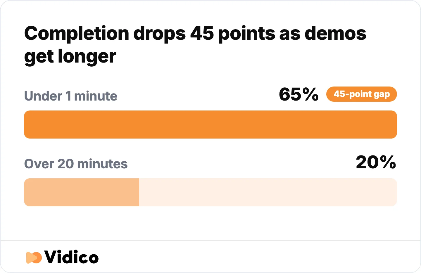
Short demos get finished. Long ones do not. Source: Vidyard Video in Business Benchmark Report.
Wistia also found that videos on homepages, video galleries and product pages get the highest play rates, and that viewers generally get about halfway through them. For a demo, that means the essential point belongs in the first half.
| Placement | Recommended runtime | What it needs to do |
|---|---|---|
| Social feed | 15 to 30 seconds | Land one feature or one moment |
| Homepage | 60 to 90 seconds | Explain the category and the core value |
| Product page | 90 seconds to 3 minutes | Walk one full workflow |
| Sales enablement | 3 to 5 minutes | Support a pausable, discussed viewing |
| Onboarding | 2 to 4 minutes, or a series | Get a new user to first value |
One caveat worth carrying: Wistia notes that a 10-minute video with a lower engagement rate still accumulates more total watch time than a one-minute video with a higher engagement rate. Engagement rate alone is not the goal. Match the runtime to the job.
How Much Do Product Demo Videos Cost?
Most companies spend under $5,000 producing a product demo video. Wistia’s State of Video report found almost 40% of companies spent under $5,000 on video production last year, with just over 30% spending more than $5,000. Around a quarter of companies outsource production rather than handling it in-house.
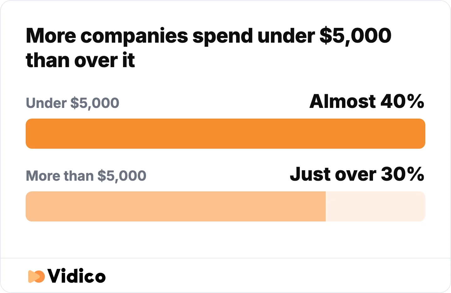
Most demo budgets sit under $5,000. Source: Wistia State of Video report.
Cost is driven by four things: how much of the product has to be animated rather than recorded, how much scripting the concept needs, how many aspect ratios and cutdowns are delivered, and how many revision rounds are built into the agreement.
The bands in the following table reflect what we see across our own production work, as of July 2026. They are our figures rather than a market survey.
| Format | Typical band | What drives the cost |
|---|---|---|
| Screen recording with light editing | $500 to $2,000 | Minimal, mostly editing time |
| Screen recording with motion graphics | $2,000 to $6,000 | Overlay design and callout animation |
| Stylised UI animation | $5,000 to $12,000 | Rebuilding the interface as motion assets |
| Full 2D or 3D animation | $8,000 to $20,000 | Concept, storyboard, illustration, animation |
| Live action production | $10,000 to $30,000+ | Crew, location, talent, shoot days |
For a strategic SaaS demo built with stylised UI and a modular asset bank that can be updated as the product changes, we typically see projects land between $10,000 and $20,000. The asset bank is the part that changes the maths over time: the first demo carries the setup cost, and every subsequent demo reuses the system.
Our own work runs on monthly plans starting around $5,000 per month rather than per-project quotes, with unused budget rolling over. We keep a fuller breakdown of product video costs covering the variables above in more detail.
What a Weak Product Demo Looks Like
The most upvoted request in the r/SaaS threads that rank for this query is for counter-examples: what a bad demo looks like, so the good ones can be compared against something. None of the pages currently ranking for this keyword provide them. These are the patterns we see most often in demos that underperform.
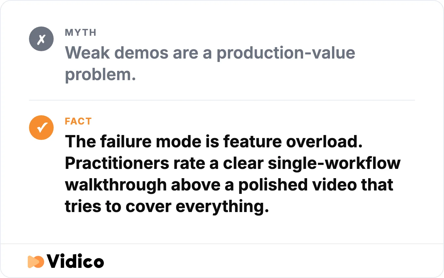
Demos fail on what they cover, not on how they look. Source: Vidico.
The feature tour. The video moves through the navigation menu, covering each section in the order the product is built rather than the order a user encounters it. It covers everything and holds nobody. Nobody finishes it and nobody remembers a single capability from it.
The demo that outruns the product. The video shows a workflow that technically exists but is slower, rougher or more manual than the edit implies. This converts well and retains badly. Practitioners name this as the single clearest tell of a category in trouble.
The 40-second warmup. Company history, a logo animation, a mission statement, then the product. Viewers who came to see whether the product solves their problem leave before it appears.
The unreadable dashboard. A dense analytics interface screen-recorded at full resolution and watched on a phone. The visual is technically accurate and communicates nothing.
The demo with no next step. The video ends, the viewer is convinced, and there is no obvious action. A demo that persuades and then stops is a conversion leak, not a branding exercise.
The one-format master. A single 16:9 video pushed to a website, LinkedIn, a sales deck and paid social without recutting. It underperforms everywhere except the one placement it was built for.
How to Make a Product Demo Video That Converts
Building a demo that converts is a sequencing problem more than a production problem. The steps below are the order we work in.
- Define the one decision the video has to move. Not “explain the product.” Something closer to “get a technical evaluator comfortable enough to start a trial.”
- Pick the single workflow that maps to that decision. If two workflows compete, make two videos. A demo covering both will convert on neither.
- Write the problem before the product. The first 10 seconds establish the situation the viewer recognises. The product enters as the resolution, not as the subject.
- Choose the format from the product, not from preference. Technical buyer and a real interface means screen capture. Abstract or sensitive subject means animation. Physical product means live action.
- Build a realistic data set. Demo environments with placeholder names and empty dashboards undercut the whole video. Populate it as a real account would look.
- Script to the runtime, then cut 20%. Almost every demo script is too long at first draft. The cut is where pacing comes from.
- Design for sound-off first. Most social views are muted. If the video only works with narration, it only works in half its placements.
- Produce the cutdowns alongside the master. Aspect ratios and short versions are cheaper produced together than retrofitted later.
- End on one specific action. “Start your 14-day trial” outperforms “learn more” because it names what happens next.
We keep a software demo script template covering the scripting and format steps if you are writing this yourself.
How to Measure Product Demo Performance
Measure a product demo on three things: whether people start it, whether they finish it, and whether they act afterwards. Most teams track only the first.
- Play rate. The share of visitors who press play. Wistia’s data shows product pages, homepages and video galleries produce the highest play rates, so a low play rate usually points at placement or thumbnail rather than at the video.
- Engagement rate. How much of the video the average viewer watches. Wistia found viewers typically get about halfway through videos in these placements, so a sharp drop before the midpoint indicates a pacing problem in the first half.
- Drop-off point. Where viewers leave. A consistent cliff at a specific second is the metric you can act on fastest, because it identifies the exact moment the video loses people.
- Conversion after view. Trial starts, demo requests or sales conversations from viewers against non-viewers. This is the number that justifies the production budget.
- Sales usage. Whether the sales team actually sends the video. A demo the sales team ignores has failed a test that no analytics dashboard reports.
Wistia also found that the best placement for an interactive element such as a call to action or a lead form is at the end of the video, after the value has been delivered.
Why Teams Work With Vidico
We are a B2B explainer and demo video company built for ongoing production rather than one-off projects, working with SaaS, fintech and enterprise teams from Melbourne, Sydney, New York, Dubai and Singapore.
Reusable systems rather than one-off projects. We build a library of branded templates and motion assets for each client, so the second demo costs less than the first and the fifth costs less than the second. Teams with reusable asset systems ship in one to three days against the four to 14 days most teams report, according to our 2026 State of Creative Marketing in Tech report. Our portfolio covers demo, explainer and product video work across SaaS, fintech and enterprise.
One production becomes many assets. A single demo shoot or animation build produces the master, the aspect-ratio variants, the social cutdowns and the ad versions, all produced together rather than retrofitted.
Scale we can point at. 2,000+ campaigns, 1.5 billion+ views, and work across 450+ tech brands. For Square, that has meant 200+ assets a month across 200+ markets with a 43% conversion lift on the creative we produced. For NinjaOne, campaigns we produced generated 66.6 million views and 1.42 million clicks. Our case studies cover the full set, including the Square and Nutrislice projects featured above.
Subscription rather than per-project quoting. Monthly plans covering demo, explainer, motion graphics and ad creative under one fee, with unused budget rolling over, so you are not renegotiating scope every time the product changes.
If a demo video is the specific need, our software walkthrough video and product video production services cover it directly. If you would rather start by seeing how your current creative compares, our Creative Intelligence Report is a free competitive analysis across 12 areas, delivered in 48 hours.
Frequently Asked Questions
What is an example of a product demonstration?
A product demonstration is any video, live session or interactive experience that shows a product working. Square’s retail demo is one example: it holds the card reader and the point-of-sale app in the same frame so a viewer sees the hardware and software operating together. Software demonstrations are usually screen recordings or stylised interface animations, while physical product demonstrations are typically filmed in the situation the product is used in.
How long should a product demo video be?
Most product demo videos should run between 30 seconds and two minutes. Vidyard’s benchmark data found 65% of viewers finish videos under one minute, compared with 20% for videos over 20 minutes. Set the length by placement: 15 to 30 seconds for a social feed, 60 to 90 seconds for a homepage, and 90 seconds to three minutes for a product page where the viewer has already shown intent.
What is the best intro for a demo?
The best demo intro opens on the problem the viewer already has, not on the company or the product. Establish the situation in the first 10 seconds, then introduce the product as the resolution. Company history, logo animations and mission statements at the start are the most common reason viewers leave before the product appears.
Should a product demo show every feature?
No. A demo should follow one workflow end to end rather than tour the full feature set. Covering everything produces a video that is accurate and unwatchable. If two workflows both matter to the buying decision, produce two demos rather than combining them, because a combined video usually converts on neither.
Is animated or live-action better for a product demo?
Neither is better in general. The choice follows the product. Screen capture and stylised UI animation suit software with a real interface a technical buyer wants to see. Full animation suits abstract products, sensitive subject matter, or concepts with no visual form. Live action is necessary for physical products, and the right call when the purchase decision is emotional rather than technical.
How much does a product demo video cost?
Most companies spend under $5,000. Wistia’s State of Video report found almost 40% of companies spent under $5,000 on video production last year, with just over 30% spending more. Cost rises with how much of the product must be animated rather than recorded, how many aspect ratios are delivered, and how many revision rounds are included. For a strategic SaaS demo built with stylised UI and a reusable asset bank, we typically see projects between $10,000 and $20,000.
How do you measure whether a product demo worked?
Track play rate, engagement rate, drop-off point, and conversion after viewing. Play rate diagnoses placement and thumbnail. Engagement rate and drop-off diagnose pacing, and a consistent drop at a specific second identifies exactly where the video loses people. Conversion after viewing, measured against non-viewers, is what justifies the production budget. Whether the sales team actually sends the video is the qualitative check worth adding.
Are interactive demos replacing demo videos?
Interactive demos are taking share for self-serve evaluation, not replacing video outright. Gartner found 67% of B2B buyers prefer a rep-free buying experience, which pushes buyers toward anything they can explore without booking a call. In practice the two do different jobs: a video establishes in 90 seconds whether the product is relevant, and an interactive demo lets a buyer who is already interested test specific workflows.
Can product demo videos be reused as the product changes?
Yes, if they are built modularly from the start. Producing a demo as separate segments with a reusable library of interface assets and motion templates means a single section can be re-rendered when a feature changes, rather than the whole video being reshot. Stylised UI animation reuses particularly well, because the rebuilt interface does not have to be recaptured every time the real product is redesigned.
Conclusion
The demos in this list share one property: each reduces how much work the viewer has to do to understand whether the product applies to them. Square holds hardware and software in one frame. Canva demonstrates a single feature in under 20 seconds. Notion answers why before what. None of them is trying to cover everything.
The practical decisions are narrower than they first appear. Pick one workflow. Open on the problem. Match the runtime to the placement. Build the cutdowns alongside the master rather than after it. Most demos that underperform failed at one of those four points rather than at production quality.
We build demo and product videos for B2B and tech teams on reusable template systems, so the second video costs less than the first. If you want to work out what your demo would take, our pricing estimate takes about a minute, or you can talk it through with our team.