
The best app onboarding videos use dynamic visuals to show value immediately. Looping animations, auto-playing GIFs, and interactive walkthroughs guide new users through key features without forcing them to sit through long tutorials. The 12 examples below are organized by the onboarding technique each one uses, so you can match the right approach to your product.
Key Takeaways
- Dynamic visuals beat static tutorials. Apps that guide new users to value keep more of them past day one than apps that drop people onto an empty screen. Looping video, auto-playing GIFs, and interactive walkthroughs outperform text-based guides.
- Technique matters more than production budget. The strongest onboarding videos use a specific pattern (progressive disclosure, deferred signup, benefit-first animation) matched to the product. Duolingo’s learn-by-doing approach and Slack’s contextual tips cost nothing to record but drive high activation.
- Onboarding content should be modular, not monolithic. Short, segmented videos (under 90 seconds each) for different features and user types outperform single long tutorials. Users watch what they need when they need it.
- Day-1 retention sits around 25-30% across mobile apps. Most installs never come back after the first day, according to enable3’s app retention benchmarks. That makes the first-session onboarding video the highest-impact content you can produce.
Content
Top 12 App Onboarding Video Examples
1. Vidico x Worksuite: Animated SaaS Walkthrough
Watch: Worksuite Onboarding Demo
Worksuite’s onboarding video walks new users through its workforce management platform with animated UI sequences. Rather than one long overview, it shows the product in action and keeps the focus on getting started, so users see how the platform works before they explore on their own.
The animation mirrors the real interface, so there is little gap between what the video shows and what users see when they open the app. Instead of explaining every feature upfront, it leads with the first actions a new user takes.
Vidico builds onboarding videos like this as reusable template systems. The visual elements are designed so Worksuite can update them when the UI changes or new features launch, which keeps the onboarding current without starting a new production from scratch.
Key Elements:
- Animated UI walkthrough that mirrors the product
- Focus on first actions, not a full feature tour
- Clean motion graphics of the interface
- Built as a reusable template for future updates
2. Duolingo: Learn-by-Doing with Deferred Signup
Duolingo lets users complete their first language lesson before asking them to create an account. This deferred signup pattern removes every barrier between download and the moment the user experiences value.
The onboarding animation is the product itself. Users pick a language, answer their first questions, and see their progress bar fill before they enter an email address. The gamification elements (streaks, XP points, level progression) activate during the first session, not after registration.
This approach works because it proves the product delivers before asking for commitment. Duolingo’s onboarding is a common reference point precisely because users feel the product work before they ever sign up. The onboarding video content is embedded in the app flow as short animated transitions between tasks, keeping users oriented without interrupting the lesson.
Key Elements:
- Deferred signup (experience value before registration)
- Gamification from the first interaction
- Animated transitions embedded in the learning flow
- Progress indicators that create immediate momentum
3. Slack: Progressive Disclosure with Slackbot
Slack uses progressive disclosure to introduce features only when users need them. The Slackbot sends contextual messages that teach one feature at a time, starting with sending a message and gradually introducing channels, threads, reactions, and integrations.
The onboarding is not a video you watch. It is a series of short, animated tooltips and bot-driven prompts that appear inside the product as you use it. Each prompt includes a brief animation showing exactly what to click or type. Users learn by doing real tasks in their actual workspace, not by watching a separate tutorial.
Progressive disclosure is one of the most common onboarding techniques in modern apps. It prevents information overload by matching the complexity of the guidance to the user’s current stage.
Key Elements:
- Contextual tips triggered by user actions
- Slackbot as an interactive onboarding guide
- Features revealed gradually (channels, threads, integrations)
- In-app animations instead of external video tutorials
4. Notion: Template-First Quick Start
Notion’s onboarding skips feature tours entirely. Instead, it asks new users to pick a use case (project management, notes, wiki, docs) and drops them into a pre-built template. Users interact with real content from their first click.
The onboarding video elements are embedded as short animated walkthroughs within the template. Notion shows users how to edit a block, create a page, and share with teammates through brief looping animations that play inline. No modal popups. No forced video player.
This template-first approach reduces time-to-value to nearly zero. Users see a functional workspace populated with sample content, not an empty screen with a blinking cursor. The onboarding teaches by letting users modify working examples rather than building from scratch.
Key Elements:
- Use-case selection at signup (project management, wiki, docs)
- Pre-built templates with sample content
- Inline animated walkthroughs within templates
- Zero empty-state friction
5. Vidico x Loanworks: Software Walkthrough for a Lending Platform
Watch: Loanworks Software Walkthrough
Loanworks needed an onboarding video that orients new users to its lending platform. The walkthrough covers the core workflow in plain language, so first-time users understand how to move through the product without wading through every feature.
The video keeps the focus on the tasks users actually need: applying, tracking status, and managing applications. It demonstrates the real workflow step by step rather than listing features, which suits financial software where the process matters more than the interface.
Vidico produces walkthroughs like this so complex products feel approachable on the first try. The plain-language approach lowers the barrier for non-expert users who would otherwise reach for a manual or a support call.
Key Elements:
- Step-by-step walkthrough of the core workflow
- Task-focused demonstrations (apply, track, manage)
- Plain language for non-expert users
- Built to orient first-time users to a complex product
6. Figma: Collaborative Interactive Tutorial
Figma’s onboarding drops new users into an interactive design file where they practice real actions: moving objects, resizing frames, and adding text. The tutorial runs inside the actual editor, not in a separate walkthrough mode.
The onboarding includes short animated prompts that highlight specific tools as users need them. When a user hovers over the pen tool for the first time, a brief animation demonstrates the draw action. Figma also shows a live cursor for collaborative editing early in the onboarding, establishing its core differentiator (real-time collaboration) within the first minute.
Interactive tutorials work well for tools where the product IS the interface. Figma’s approach turns the onboarding into a mini-project, so users finish with something they made rather than just a list of features they watched.
Key Elements:
- Interactive tutorial inside the real editor
- Tool-specific animated prompts on hover
- Collaborative cursor shown early (core differentiator)
- Users finish onboarding with a completed mini-project
7. Pitch: Auto-Playing GIFs in Welcome Modals
Pitch uses targeted, auto-playing GIFs within welcome modals to show how to build and edit presentation decks. Each modal demonstrates one action (adding a slide, applying a template, sharing with teammates) in a 3-5 second looping clip.
This format hits the sweet spot between static text and long onboarding videos. Users see exactly what to do without leaving the context of their workspace. The GIFs load instantly, play silently, and loop until the user dismisses the modal or completes the action.
Appcues documents this pattern as one of the most effective for SaaS tools with visual interfaces. The GIF format is lightweight enough to embed anywhere in the product without performance impact, and it communicates spatial UI actions (drag, drop, resize) better than text or static screenshots.
Key Elements:
- Auto-playing GIFs in context-specific modals
- 3-5 second loops demonstrating single actions
- No audio required (silent, visual-first)
- Lightweight enough to embed throughout the product
8. Linktree: Dynamic Profile Setup with Celebratory Animations
Linktree’s onboarding auto-searches for a user’s existing social profiles and web presence during setup, pre-populating links so the user doesn’t start from zero. The setup flow ends with a celebratory confetti animation when the profile goes live.
This dynamic onboarding approach does two things well. First, it reduces manual input by pulling in existing data. Second, the celebratory animation at completion creates an emotional reward that reinforces the action. Users associate their Linktree profile with a positive moment rather than a chore.
The confetti/celebration pattern is a form of emotional design in onboarding. It signals “you did it” without any text, turning the last step of setup into a small reward rather than a dead end.
Key Elements:
- Auto-detection of existing social profiles
- Pre-populated setup (reduced manual input)
- Celebratory confetti animation on completion
- Emotional design that makes setup feel rewarding
9. Headspace: Benefit-First Emotional Animation
Headspace opens with calm, hand-drawn animations that focus entirely on what the user will feel, not what the app does. The onboarding video shows scenes of stress melting away, better sleep, and clearer thinking before it ever introduces a meditation timer or course library.
This benefit-first approach works for products where the user’s emotional state IS the use case. Headspace does not onboard users by showing them where the play button is. It onboards by reminding them why they downloaded the app and validating their decision.
The animation style matches the product’s calming purpose. Soft colors, slow transitions, and ambient sound create an experience that feels like the first meditation session, not a product tutorial. By the time users see the actual interface, they are already in the right headspace.
Key Elements:
- Benefit-first messaging (feelings before features)
- Hand-drawn animation matching brand personality
- Calming visual rhythm that mirrors the product experience
- Interface introduction delayed until emotional buy-in is established
10. TikTok: Instant Value with No Signup Wall
TikTok drops new users straight into the For You feed before asking them to create an account. There is no signup wall and no tour. The first thing a new user gets is the core experience: a full-screen, autoplaying video they can react to right away.
The onboarding is the feed itself. As users swipe, the app learns what they like and tunes recommendations fast, so the product feels personalized inside the first session. Signup comes later, once the user has already felt the value.
This instant-value pattern removes the gap between opening the app and understanding why it exists. It runs on the same principle as Duolingo’s deferred signup: let people experience the product first, then ask for commitment once they are hooked.
Key Elements:
- Instant value, with the core experience before any signup
- No tour or tutorial blocking the first session
- Fast personalization that tunes the feed as users swipe
- Deferred signup, so commitment comes after the payoff
11. Vidico x Deloitte: Enterprise Sales App Video
Watch: Deloitte Sales App Video
Deloitte needed an onboarding video for an internal sales application that holds corporate standards while keeping users engaged. The video demonstrates the app’s workflow clearly, so employees can get productive without sitting through a long training session.
It moves through a complex enterprise workflow efficiently, with a clean structure that goes from introduction to core workflow without a feature-by-feature tour. The professional tone matches the brand, which matters for an internal tool that has to feel as polished as the work it supports.
Enterprise onboarding faces a specific challenge: the audience is required to use the tool. Unlike consumer apps where users can leave, enterprise users need to learn the system. That changes the video’s job from “convince them to stay” to “get them productive fast.”
Key Elements:
- Clear demonstration of a complex enterprise workflow
- Professional tone matching corporate brand standards
- Efficient structure with no feature-by-feature tour
- Built to get required users productive quickly
12. Basecamp: Systematic Tool Walkthrough
Basecamp’s onboarding video walks users through six core tools systematically, showing how teams use each one in real scenarios. The video covers message boards, to-dos, schedules, docs, campfires, and check-ins in a structured sequence.
The systematic approach works because Basecamp is an opinionated product. Users need to understand the complete system to get value, not just one feature. The video builds understanding progressively: each tool builds on the previous one, showing how they connect in a real project workflow.
Basecamp pairs the walkthrough video with in-app prompts that trigger when users access each tool for the first time. The video provides the big picture. The in-app prompts provide the specific guidance. This layered approach means users are never more than one click away from help.
Key Elements:
- Systematic coverage of all six core tools
- Real team scenarios showing tools in context
- Progressive structure (each tool builds on the previous)
- Paired with in-app contextual prompts
What Is an App Onboarding Video?
App onboarding videos are short visual guides that help new users understand and use an app effectively after their first download or signup. They differ from marketing demos in one key way: demos convince people to try your product, onboarding videos help people who already signed up succeed with it.
An onboarding video helps users who already signed up, not prospects deciding whether to try.
There are four main types of onboarding video content:
- Animated explainers show how a product works through motion graphics and illustration (Headspace, Worksuite)
- Screen recordings demonstrate the real app interface with visual highlights showing exactly where to click (Loanworks, Deloitte)
- Interactive walkthroughs let users practice actions inside the product while animated prompts guide them (Figma, Slack)
- Embedded micro-animations play as looping GIFs or short clips within the app itself, triggered by user actions (Pitch, Notion)
Users decide fast whether an app is worth keeping, often within the first few sessions. Onboarding videos need to guide users to their core “aha moment” inside that short window.
Want to know what’s working for B2B tech teams in 2026? The full report covers budgets, testing, AI, and proof.
Why App Onboarding Videos Matter
Day-1 retention across mobile apps sits around 25-30%, according to enable3’s app retention benchmarks. That means most people who install your app never come back after the first day. Structured onboarding helps: apps that guide new users to value keep more of them past day one than apps that drop people onto an empty screen.
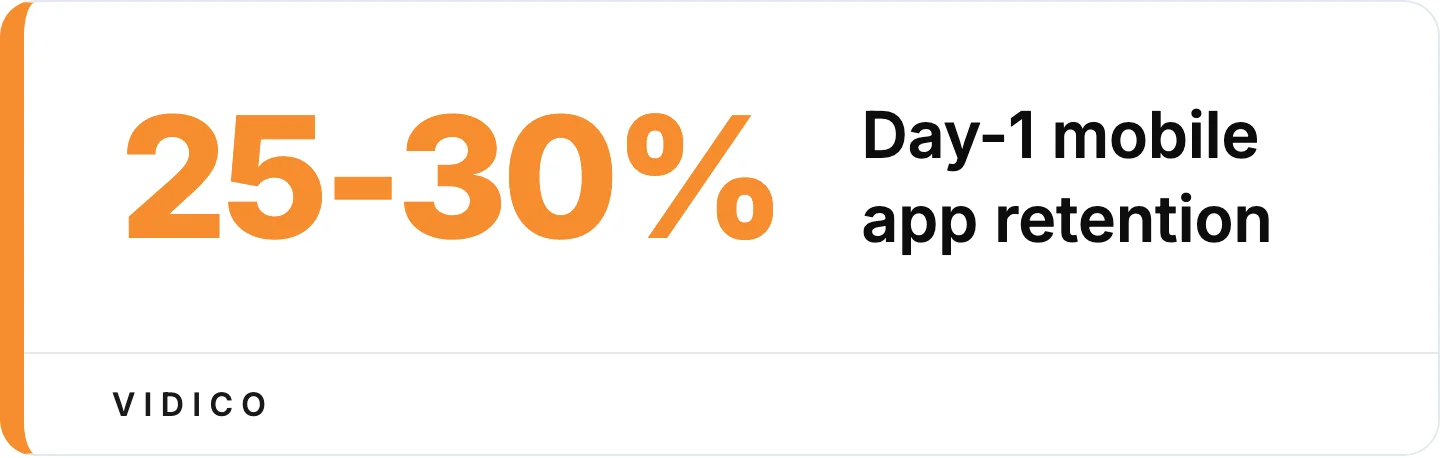
Most installs never return after day one, per enable3’s app retention benchmarks.
Video-based onboarding scales in a way text tutorials cannot. One well-produced walkthrough answers the same questions for 10 users or 100,000 users without any additional cost. Many people would rather watch a short video than read documentation when they are learning a new tool, which is why a clear walkthrough beats a wall of help text.
The business impact goes beyond retention. A large share of SaaS churn happens early, in the first weeks after signup, before users reach the product’s core value. Effective onboarding videos address that window directly by getting users to value faster and reducing the volume of support requests for basic how-to questions.
Onboarding video content also drives feature adoption for existing users. When you launch a new feature, a short walkthrough video embedded at the point of discovery helps users try it immediately rather than ignoring it or filing a support ticket asking what it does.
The same idea works for internal training. See our e-learning video production service.
Best Practices for App Onboarding Videos
Use progressive disclosure, not feature dumps. Reveal one feature at a time, triggered by user actions. Slack’s Slackbot pattern is the gold standard: users learn about threads when they first encounter a thread, not during a long setup tour. Progressive disclosure shows up in nearly every onboarding guide and is one of the most commonly recommended patterns.
Keep each video segment under 90 seconds. Videos under a minute average a 52% engagement rate, and shorter videos hold attention better, according to Wistia’s State of Video report. Break complex onboarding into multiple short segments rather than one long tutorial. Users watch the segment relevant to their current task.
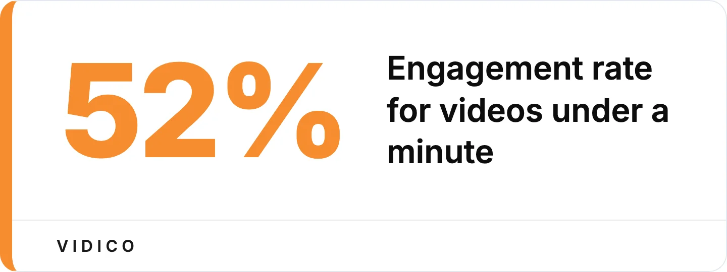
Shorter segments hold attention better, per Wistia’s State of Video report.
Lead with benefits, then show features. Headspace opens with what the user will feel. Duolingo opens with a lesson, not a tour. The most effective onboarding videos establish why the user should care before explaining how the product works.
Segment content by user type. Different users need different onboarding paths. Lending platforms, for instance, need separate walkthroughs for borrowers and loan officers, built from one shared production framework. If your app serves multiple roles, build separate onboarding tracks.
Build reusable templates. One of the biggest barriers to onboarding video production is updating content when the product changes. Build modular, template-based video assets so updating a single feature walkthrough does not require reproducing the entire onboarding sequence.
Add captions to every video. Many users watch onboarding content on mobile with sound off. Captions ensure your guidance communicates even when muted. This is also an accessibility requirement.
Place videos contextually. Trigger onboarding video content at the moment users need it. In-app tooltips, first-use modals, and help center embeds work better than a single onboarding video email sent at signup. Figma and Pitch both use this approach effectively.
Common App Onboarding Video Mistakes
Forcing a long tutorial before letting users try the app. Nielsen Norman Group’s research on mobile onboarding warns against long upfront instructions that users skip. People want to do something, not watch something. Duolingo’s deferred signup exists for this reason: let users start the first lesson before asking for anything.
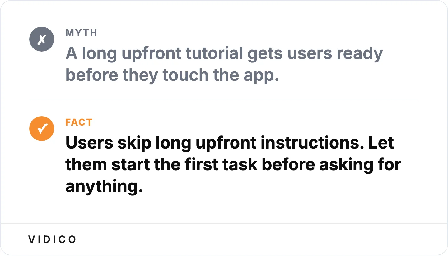
Nielsen Norman Group warns against long upfront instructions users skip.
Building one video for all users. A startup founder, a project manager, and a developer need different onboarding guidance for the same product. One-size-fits-all tutorials try to cover everything and end up being too generic for anyone.
Mixing promotional content into educational sections. When an onboarding video transitions from “here’s how to use this feature” to “upgrade to Pro for more features,” users lose trust in the guidance. Keep educational content separate from upsell messaging.
Showing every feature in order. Users don’t need a tour of the settings menu during their first session. They need to accomplish one meaningful task. Feature-complete walkthroughs feel like product documentation, not onboarding.
Ignoring mobile viewing. Much of app onboarding happens on mobile screens. Videos with small text, dense UI screenshots, or horizontal-only formatting fail on phones. Design for the screen size your users will see.
Why Work With Vidico
We produce B2B explainer and product videos for SaaS teams. Our subscription model covers explainer, motion graphics, ad creative, and social content under one monthly fee, with reusable templates so each campaign ships faster than the last.
The onboarding videos in this guide (Worksuite, Loanworks, Deloitte) were built using our systematic production approach. Each project creates a reusable template library the client uses for future updates, so onboarding content stays current as the product evolves.
Verified results from our app and product video work:
- Wisr: 10,000+ app downloads from a product and brand video
- HoneyBook: 9% lift in waitlist signups from an A/B tested explainer video
- Taggg: First 250 platform users attributed directly to the launch video
We have produced 2,000+ campaigns for 920+ clients including Square, Spotify, and Airtable, with production teams in Melbourne, Sydney, New York, Dubai, and Singapore.
Get a free Creative Intelligence Report to see how your onboarding content compares to competitors across 12 areas of analysis.
Onboarding videos share a lot with product demo video examples — both need to show the product working fast.
FAQs
How long should app onboarding videos be?
App onboarding videos should run 60-90 seconds for getting-started content. Welcome videos can be shorter at 30-45 seconds. Complex workflow walkthroughs may extend to 2-3 minutes, but break these into separate segments when possible. Videos under a minute hold viewers best, averaging a 52% engagement rate in Wistia’s State of Video report, so shorter segments with focused topics outperform single long tutorials.
Should we create one long video or multiple short ones?
Multiple short videos outperform single long tutorials for app onboarding. Create separate segments for different features and user types. This modular approach lets users watch only what they need when they need it, enables contextual delivery (triggering the right video at the right moment in the app), and improves completion rates.
How do we measure onboarding video success?
Track five metrics to evaluate onboarding video performance: video completion rate, time from signup to first meaningful action, support ticket volume for topics covered in onboarding videos, feature adoption rates for demonstrated capabilities, and day-1/day-7 retention rates comparing users who watched onboarding content versus those who skipped it. Good day-1 retention benchmarks are around 30%, day-7 around 15%, and day-30 around 7-10%.
What is the difference between onboarding videos and product demos?
Product demo videos convince potential customers to try your app. Onboarding videos help existing users succeed after they have already signed up. Demos showcase the best features to drive signups. Onboarding videos guide users through the specific actions they need to take right now. The audience, goal, and placement are different: demos live on landing pages and sales decks, onboarding videos live inside the product or in post-signup email sequences.
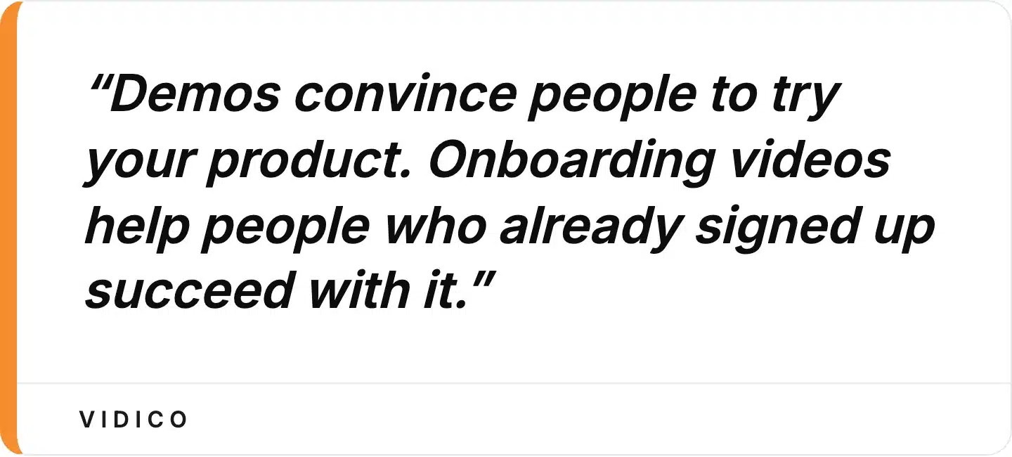
The audience, goal, and placement differ between demos and onboarding videos.
Can we create effective onboarding videos in-house?
Yes, with the right approach. Many of the examples in this guide (Slack’s Slackbot prompts, Notion’s inline animations, Figma’s interactive tutorial) were built by in-house teams. Start with simple screen recordings of your core workflow, add captions, and test with real new users. For more complex animated explainers or multi-segment onboarding systems, working with a production team that builds reusable templates makes the process more efficient and consistent.
Final Thoughts
The best app onboarding video examples share a pattern: they guide users to their first success as fast as possible using the format that fits the product. Duolingo lets users learn before signing up. Slack teaches one feature at a time. Pitch embeds silent GIFs right where users need them. The technique matters more than the production budget.
At Vidico, we build B2B explainer and onboarding videos for SaaS teams, with a systematic production approach that creates reusable templates for ongoing content needs. Our work with clients like Wisr (10,000+ app downloads) and Taggg (first 250 platform users from video) shows what onboarding video content can do when it is built strategically.
If your onboarding relies on text tutorials or a single overview video, there is a measurable gap between where you are and what the data shows is possible. Book a free strategy session to map out a video onboarding system for your product.
Ready to build one for your own app? Vidico’s app onboarding video production team can take it from script to launch.