The best explainer videos share three things: a clear problem-solution structure, visuals that simplify instead of decorate, and a runtime under two minutes. This list breaks down 20 standout examples across SaaS, finance, ecommerce, and consumer brands, with a specific analysis of what makes each one work.
Whether you are planning your first explainer or rebuilding an existing one, these examples show the techniques that drive views, signups, and brand recall at scale.
Key Takeaways
- 60 to 120 seconds is the sweet spot. Most explainers on this list land between one and two minutes. Shorter videos hold attention better and force tighter scripting.
- Problem-solution structure is the common thread. Every top-performing explainer opens with a pain point the viewer recognizes, then introduces the product as the fix.
- Animation dominates, but live-action wins on personality. Most examples on this list use 2D or motion graphics. The standout live-action entries succeed because they lead with a human voice, not a product demo.
- Results are measurable. The best explainer campaigns generate millions of views, higher signup rates, and lower cost per acquisition.
- Shorter videos earn higher engagement. Wistia’s State of Video report, drawn from over 13 million videos, found that the shorter the video, the higher its engagement rate. That is why the strongest explainers stay tight.
Content
Top 20 Explainer Videos You Need to Watch
1. DigitalOcean (by Vidico)
Video Type: Animated explainer | Industry: Cloud/SaaS
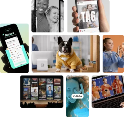
Vidico produced DigitalOcean’s App Platform explainer to make a developer product easy to grasp for a wider buyer. The animation turns app deployment into a simple visual sequence: push your code, and the platform handles the infrastructure. No jargon, no dashboard tour.
The explainer drove 3.7 million-plus YouTube views and a lower cost per acquisition across its paid campaigns. The clarity is the point: a viewer who has never deployed an app still understands the before-and-after.
Key Takeaway: When the product is technical, animate the outcome, not the interface. Show what the buyer gets, not every step they take to get it.
2. HoneyBook (by Vidico)
Video Type: Explainer video | Industry: B2B SaaS
Vidico produced HoneyBook’s explainer to show independent business owners how one platform handles bookings, contracts, invoices, and payments. The video follows a single client relationship from inquiry to paid, so the value lands as a story instead of a feature list.
In an A/B test, the page with the explainer delivered a 9% lift in waitlist signups over the page without it. That is the explainer doing measurable work, not just looking good.
Key Takeaway: Treat the explainer as a testable asset. HoneyBook proved its value by running the page with and without the video, then kept the winner.
3. Dollar Shave Club
Video Type: Live-action | Industry: Consumer/DTC
Dollar Shave Club’s 2012 launch video is the most-cited explainer in marketing history for a reason. CEO Michael Dubin walked through a warehouse delivering a deadpan pitch for a dollar razor subscription while absurd props and sight gags unfolded around him. The video reportedly cost about $4,500 to make.
The structure is textbook: problem (overpriced razors), solution (Dollar Shave Club), proof (the product itself), CTA (join the club). It runs about 90 seconds and reportedly drove 12,000 orders in its first 48 hours. The humor is the hook, but the clarity of the value proposition is what converts.
Key Takeaway: Personality and a tight problem-solution script outperform production budget every time.
4. Dropbox
Video Type: Animated (2D) | Industry: Cloud Storage/SaaS
Dropbox’s explainer is a case study in simplicity. Its original 2009 version explained a product category that barely existed, cloud file storage, with clean line drawings of a file dragged into a folder that syncs across devices. Dropbox still leads with the same idea: show the product doing its one job, with no live actors and no complex motion graphics.
Dropbox’s founder has credited that early explainer as one of the company’s key growth drivers. It converted signups better than text could, because it showed the product in action instead of describing a new file-syncing idea in words.
Key Takeaway: When you are creating a new category, animation lets you explain something people have never seen without the limitations of filming a physical product.
Starting a new explainer video project? Grab a free script to kick off production.
5. Slack
Video Type: Live-action (mockumentary) | Industry: SaaS/Productivity
Slack’s “So Yeah, We Tried Slack” plays like a deadpan documentary about a team drowning in scattered emails, missed messages, and lost files, then slowly winning their workday back. It runs longer than a typical explainer but never feels like a feature tour.
The video works because it sells the transformation, not the tool. A viewer who has never used Slack walks away understanding the before-and-after, not a list of checkboxes.
Key Takeaway: Show the workflow change, not the feature list. Buyers remember how their day improves, not what buttons they will click.
6. Airbnb
Video Type: Mixed media (stop-motion miniatures) | Industry: Travel/Marketplace
Airbnb’s “Wall and Chain” used handmade stop-motion miniatures to tell the story of two former border guards from opposite sides of the Berlin Wall who reconnect years later through Airbnb. No screen recordings. No product UI. Just a handcrafted world that carried the brand’s “Belong Anywhere” message through pure visual storytelling.
The stop-motion miniature style set the video apart from every competitor using slick motion graphics. It communicated warmth, authenticity, and human connection, which is exactly what a platform asking you to sleep in a stranger’s house needs to convey.
Key Takeaway: When your product is trust-dependent, invest in a visual style that feels handmade and human rather than corporate and polished.
7. Duolingo
Video Type: Animated (character animation) | Industry: EdTech
Duolingo’s “Language Learning Is Hard, So We Made It Fun!” leans on Duo, the green owl mascot, and a run of visual gags about the pain of learning a language. The upbeat soundtrack and character-driven comedy carry the message with barely any dialogue.
Because the story rides on visuals and character, not narration, it travels across markets with little to translate. The animation is simple enough to be charming but detailed enough to hold attention.
Key Takeaway: If your audience is global, lean on visual storytelling and character over dialogue. Images and characters scale across languages in ways narration cannot.
8. HubSpot
Video Type: Animated (educational) | Industry: SaaS/Marketing
HubSpot’s “What is HubSpot?” explainer treats the viewer as a student, not a buyer. It walks through the platform the way a teacher would, with simple shapes for each part of the product, color coding to separate ideas, and narration that moves at a learning pace rather than a sales pace.
The video succeeds because HubSpot builds credibility through clarity instead of sales. A viewer leaves understanding something they didn’t before, which makes HubSpot the brand they remember when they need the tool.
Key Takeaway: Educational explainers that teach a concept (without selling the product) build trust faster than product demos for top-of-funnel audiences.
Want to see how your explainer video stacks up against competitors? Get a free Creative Intelligence Report with a 48-hour turnaround.
9. Notion
Video Type: Screencast/UI walkthrough | Industry: SaaS/Productivity
Notion’s “What is Notion?” explainer keeps the focus on the product itself: building a page, dragging blocks, and organizing a workspace, narrated in a calm, direct voice. The interface does most of the talking.
The approach works because Notion’s interface is the product’s selling point. Showing it build a wiki, a board, and a database communicates more than any abstract animation could. The restraint keeps the focus on the speed and flexibility of the product.
Key Takeaway: If your product’s UI is the selling point, a screencast that shows speed and flexibility beats animation.
10. Spotify
Video Type: Motion graphics | Industry: Media/Music
Spotify’s motion graphics work, especially Spotify Wrapped, turns data visualization into entertainment. Bold colors, fast transitions, and personalized stats transform a year-end usage summary into a shareable cultural event. It is a prime example of what strong motion graphics can do.
The explainer format here is non-traditional. It does not explain what Spotify is; it shows what Spotify knows about you. That shift from “here’s our product” to “here’s your story through our product” is what makes it spread organically every year.
Key Takeaway: Data-driven motion graphics personalize the explainer format. When you can show a viewer their own story, the product sells itself.
11. Shopify
Video Type: Animated (2D) | Industry: Ecommerce/SaaS
Shopify’s explainer walks an aspiring entrepreneur from idea to first sale in plain language. The style is deliberately stripped down: flat design, a limited palette, and a narrator who sounds like a supportive friend rather than a corporate spokesperson.
It leads with the buyer’s situation, wanting to start something and not knowing where to begin, before it gets to the product. That order hooks small business owners who have not yet decided they need an ecommerce platform.
Key Takeaway: Lead with the buyer’s aspiration, not your dashboard. The product reveal hits harder when the viewer is already emotionally invested.
12. Wise
Video Type: Animated explainer | Industry: FinTech
Wise’s explainer makes a confusing category feel simple. It walks through the everyday frustration of sending money abroad, hidden bank fees and bad exchange rates, then shows Wise as the transparent alternative in plain, friendly visuals.
The script stays direct: name the pain, show the fix, point to the next step. Nothing about the design feels like a bank, which is the whole idea for a money product trying to win first-time users.
Key Takeaway: For finance products, a casual, friendly visual style breaks down the intimidation barrier. People sign up faster when the product feels approachable, not formal.
According to Vidico’s State of Creative Marketing in Tech report, 42% of B2B marketers say getting attention is harder now due to competition and sameness. The brands on this list solved that problem with creative clarity.
13. monday.com
Video Type: Product demo (fast-paced) | Industry: SaaS/Project Management
monday.com’s overview takes the product demo format and edits it like a music video. Quick cuts between use cases (marketing campaigns, software sprints, CRM pipelines), upbeat music, and colorful UI shots create an energy level most SaaS explainers lack.
The speed is the strategy. Instead of explaining one use case thoroughly, the video runs through many in rapid succession. That communicates monday.com’s main selling point, flexibility across teams, faster than any slow walkthrough could.
Key Takeaway: Fast-paced editing can communicate product flexibility better than deep dives into a single feature.
14. Crazy Egg
Video Type: Product walkthrough | Industry: SaaS/Analytics
Crazy Egg’s explainer is a classic conversion-focused SaaS video. It walks through a specific problem, not knowing what visitors actually do on your website, then shows the fix: heatmaps, scroll maps, and reports that make behavior visible.
Crazy Egg’s explainers helped popularize a template thousands of SaaS companies still follow: problem, agitation, solution, feature walkthrough, CTA. The structure does the persuading, so the visuals can stay simple.
Key Takeaway: The problem-agitation-solution script structure remains the most effective framework for SaaS explainer videos, even over a decade later.
15. Headspace
Video Type: Animated (character animation) | Industry: Health/Wellness
Headspace’s “Underlying Calm” animation uses gentle character animation and soft color palettes to explain how meditation quiets a busy mind. The animation style matches the product’s core value: calmness. No jarring transitions. No aggressive CTAs. The viewer’s stress level drops just from watching the video, which is the point.
The videos typically run 60 to 90 seconds and cover one technique per video (breathing, body scan, sleep focus). This single-concept approach keeps each video focused and shareable as a standalone piece across social channels.
Key Takeaway: Match your animation style to the emotion you want the viewer to feel. A meditation app with high-energy motion graphics would contradict the product.
16. Grammarly
Video Type: Mixed media (live-action + UI) | Industry: SaaS/AI
Grammarly’s “What Is Grammarly?” explainer blends real writing scenarios (job applications, emails, school essays) with on-screen UI showing its corrections in real time. The mixed approach grounds an AI product in concrete, recognizable situations.
Each video targets a specific audience: students, professionals, job seekers. This segmentation means the viewer sees their exact use case reflected, which makes the product feel built for them rather than built for everyone.
Key Takeaway: Segmented explainers that target specific use cases convert better than one-size-fits-all product overviews.
Planning an explainer video for your product? See what the process looks like from brief to final cut.
17. Mailchimp
Video Type: Animated (brand illustration) | Industry: SaaS/Email Marketing
Mailchimp’s videos use a distinctive illustration style with exaggerated proportions, bold outlines, and playful character design. The visual identity is so strong that you recognize a Mailchimp video before the logo appears. This is brand-building through illustration style itself.
The content structure follows a familiar template: “growing a business is hard, email marketing helps, here’s how Mailchimp makes it easy.” But the visual distinctiveness elevates generic messaging into something memorable.
Key Takeaway: A distinctive visual style does brand work that scripts cannot. Invest in an illustration system that is instantly recognizable, even with the sound off.
18. PandaDoc
Video Type: Animated (2D) | Industry: SaaS/Document Management
PandaDoc’s explainer strips a multi-step workflow (drafting, approving, signing, tracking documents) into a clean sequence. It follows one document from creation to signature, showing the interface at each step without overwhelming the viewer with features.
The pacing is deliberate. Each step gets about 15 seconds of screen time. The visual transitions between steps mirror how the product actually flows, so the video doubles as an intuitive product tour.
Key Takeaway: For workflow products, follow one item through the entire process instead of explaining features in isolation.
19. Zendesk
Video Type: Product explainer | Industry: SaaS/Customer Service
Zendesk’s overview demo packs the whole product into a tight runtime. It names a problem the buyer is already living, scattered customer conversations, slow replies, and no single view of the customer, then shows Zendesk pulling tickets, chat, and knowledge base into one place.
The video works because it leads with the support team’s daily pain before it shows a single feature. The product only appears once the viewer recognizes their own problem on screen.
Key Takeaway: Open on the frustration the buyer lives every day. Showing their exact problem first earns the attention you need before you demo anything.
20. Cisco
Video Type: Animated (enterprise/infographic) | Industry: Enterprise/Security
Cisco’s security explainer takes a dense enterprise topic, securing access across distributed networks, and makes it accessible through infographic-style animation. Data flows, network diagrams, and threat visualizations replace the bullet-point slides that dominate enterprise marketing.
The video targets IT decision-makers who understand the concepts but need a clear framework for evaluating Cisco’s approach. It skips the “what is cybersecurity” basics and speaks directly to the audience’s level of knowledge.
Key Takeaway: Enterprise explainers should match the audience’s expertise level. Skipping basics and leading with a framework earns credibility with technical buyers.
Ready to create an explainer video that delivers results like these? Book a free strategy session with our team.
Types of Explainer Videos
Explainer videos fall into six main categories. The right choice depends on your product, audience, and budget.
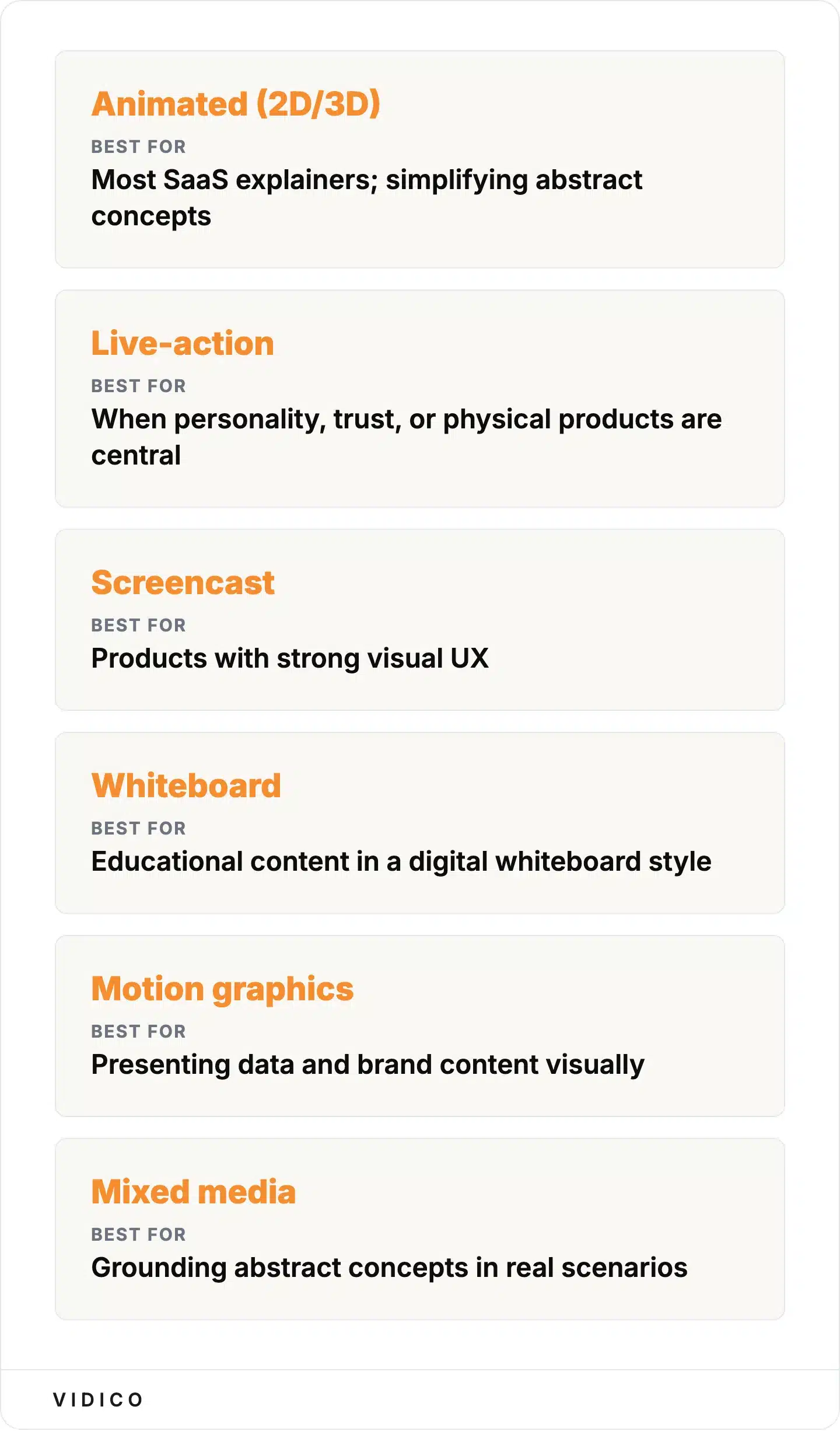
The six explainer formats and the job each does best. Source: Vidico.
Animated (2D/3D) is the most common format. 2D animation uses flat design and motion graphics to simplify abstract concepts. 3D animation adds depth and realism for physical products or architectural visualization. Most SaaS explainer videos use 2D because it is faster to produce and easier to update. Learn more about animated video production.
Live-action uses real people, real locations, and real products. It works best when personality, trust, or physical products are central to the message. Dollar Shave Club and Grammarly are strong examples. Production costs are typically higher than animation, and updates require reshoots. See how live-action compares to animation for different use cases.
Screencast records the actual product UI. Notion and Monday.com use this approach to let the interface sell itself. It is the lowest-cost option and works well for products with strong visual UX, but it can feel dry without good narration and editing.
Whiteboard uses a hand-drawing visual style, typically on a white background. It was more popular in the 2010s and has declined as audiences associate it with dated content. Updated versions using digital whiteboard aesthetics still work for educational content.
Motion graphics uses animated shapes, typography, and data visualization without characters. Spotify Wrapped is a prime example. This format excels at presenting data and brand content visually.
Mixed media combines two or more styles (live-action with animation overlays, screencast with motion graphics). Grammarly and Airbnb use this approach to ground abstract concepts in real-world scenarios while adding visual polish. Explore the different types of explainer videos in depth.
Curious where your team stands? The 2026 State of Creative in Tech report shows what’s actually working for B2B tech marketers right now.
What Makes a Great Explainer Video
Great explainer videos share six qualities, regardless of format or industry.
A clear problem-solution structure. Open with a pain point the viewer recognizes. Introduce the product as the fix. Close with a CTA. Every entry on this list follows this arc. The details change, but the skeleton does not.
A single core message. The most common mistake in explainer video production is trying to cover every feature. The best videos pick one message and build everything around it. DigitalOcean’s explainer is about simplifying app deployment. Dropbox’s is about syncing files. One idea, clearly told.
60 to 120 seconds of runtime. Reports found that the shorter a video is, the higher its engagement rate, so the tightest explainers earn the most complete views. Going much longer risks losing the viewer before the CTA.
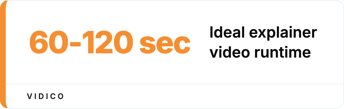
Engagement rises as videos get shorter, so the tightest explainers earn the most complete views. Source: Wistia State of Video.
A strong hook in the first five seconds. Viewers decide whether to keep watching almost immediately. The hook can be a provocative statement, a visual surprise, or a question that names the viewer’s frustration directly.
Customer language, not company language. Write the script the way the buyer describes their problem, not the way the product team describes the solution. “I can’t find my files” converts better than “centralized document management system.”
Visual storytelling that simplifies. Animation, live-action, and screencasts all work, but only when the visuals reduce complexity instead of adding it. If turning off the narration makes the video confusing, the visuals are decorative, not functional. Effective explainer videos earn their runtime by making every frame carry meaning.
The test for whether your visuals earn their runtime. Source: Vidico.
FAQs
What makes a great explainer video?
A great explainer video has a clear problem-solution structure, runs under two minutes, and delivers one core message. The best examples open with a pain point the viewer already feels, introduce the product as the fix, and close with a specific call to action. Animation quality and production value matter, but a clear script matters more. An analysis of over 13 million videos found engagement climbs as videos get shorter, which is why the best explainers stay under two minutes.
What are the different types of explainer videos?
The six main types of explainer videos are animated (2D/3D), live-action, screencast, whiteboard, motion graphics, and mixed media. Animated explainers are the most common for SaaS and tech products because they can visualize abstract concepts without the cost of live production. Live-action works best when personality or physical products are central. Screencast videos work well for software with strong visual UX. Mixed media combines styles for a more grounded feel.
Can AI make explainer videos?
AI tools like Synthesia, Invideo, and HeyGen can generate basic explainer videos from text prompts. These tools are useful for internal training content, quick social clips, and first-draft storyboarding. They fall short on brand-specific creative direction, custom illustration, strategic scripting, and emotional storytelling. For customer-facing explainers where brand quality and conversion matter, teams typically work with a professional production partner that uses AI to speed up production (scripting variations, subtitle generation, asset tagging) while keeping creative direction human-led.
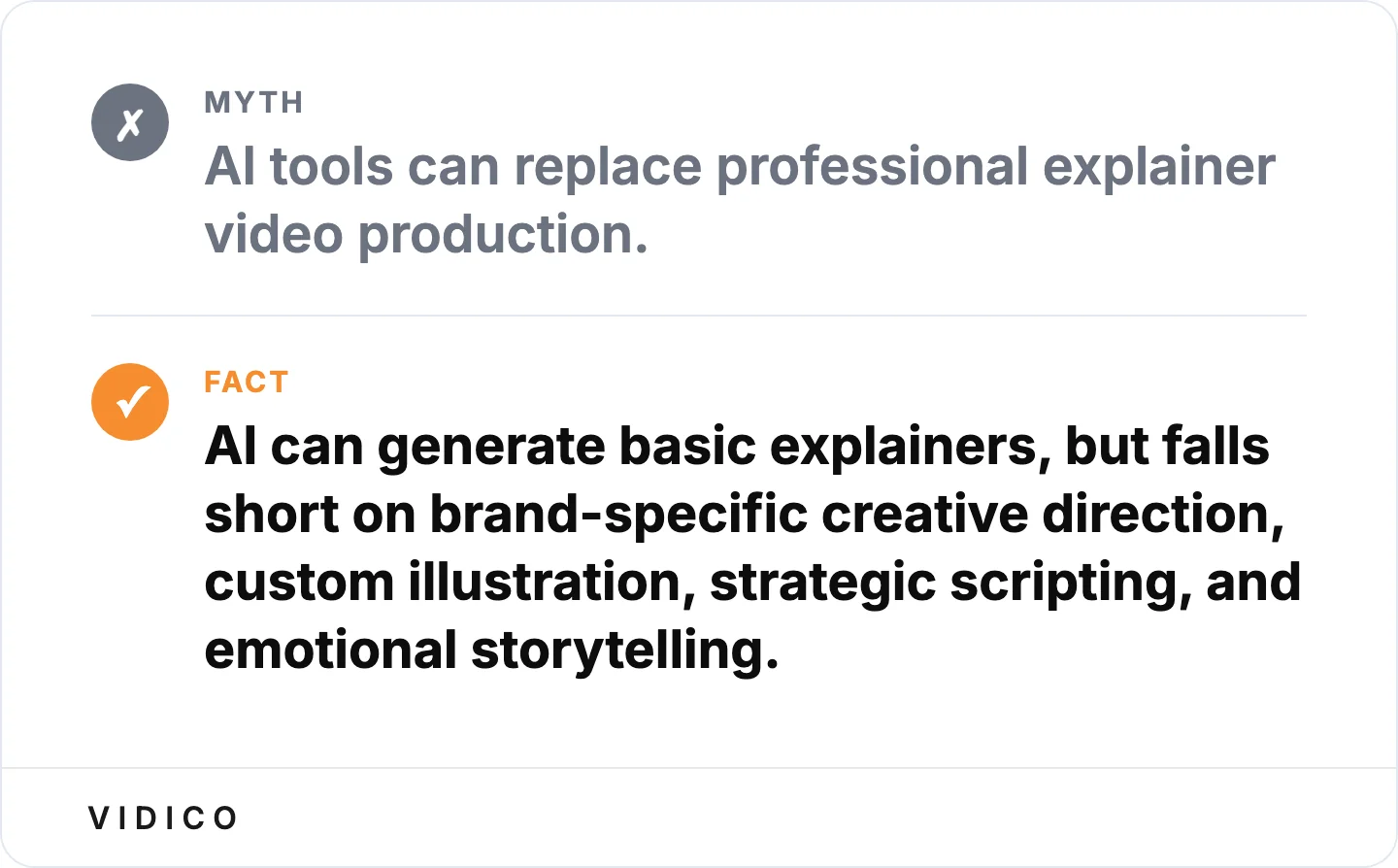
AI speeds up production but does not replace creative direction. Source: Vidico.
How long should an explainer video be?
The optimal length for an explainer video is 60 to 120 seconds. Engagement rates rise as videos get shorter, so tighter is safer. Videos under 60 seconds work well for social media and paid ads. Videos between 60 and 120 seconds work best for landing pages, product pages, and email campaigns. Going beyond two minutes risks a steep drop-off in viewer retention.
How much does an explainer video cost?
Costs vary widely by format and scope. Typical market ranges run from under $1,000 for template-based tools to $5,000 to $50,000 or more for custom professional production. AI-generated videos from tools like Synthesia or Invideo run about $20 to $100 per month. Freelance animators tend to charge $2,000 to $10,000. Studios tend to charge $5,000 to $25,000 for a standard animated explainer, with complex 3D or live-action work going higher. The price depends on length, animation style, custom illustration, voiceover talent, and revision rounds. For current figures, see Vidico’s breakdown of video production costs and animation pricing.
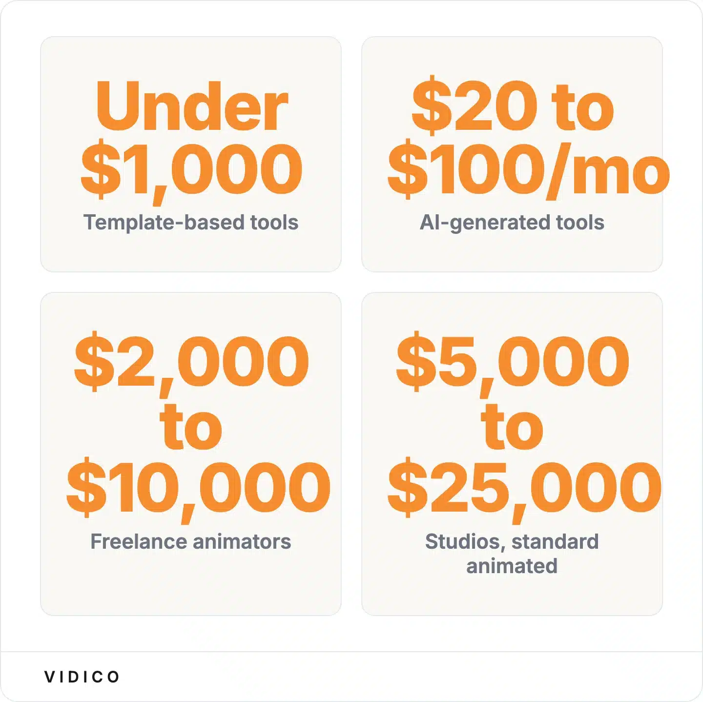
What different producers charge for an explainer video. Source: Vidico.
Conclusion
The 20 explainer videos on this list include a roughly $4,500 warehouse shoot that drove 12,000 orders in 48 hours and SaaS explainers that pulled millions of views and measurable signup lifts. The budgets vary. The pattern does not: a specific problem, a specific solution, and a visual format that makes both obvious at a glance.
At Vidico, we produce B2B explainer videos for SaaS and tech brands, with 2,000+ campaigns shipped for clients including DigitalOcean, Square, and Spotify. The pattern we see in every successful explainer is the same one these 20 examples prove: start with the buyer’s problem, build a visual system around the solution, and keep it under two minutes.
If you are planning an explainer video and want to see how your concept compares to what is working in your market, book a free strategy session with our production team.