Fintech sells something you cannot hold. A payment clears, a loan gets approved, data moves between two apps, and none of it happens where the buyer can see it. The best fintech explainer videos fix that. They take one invisible flow and make it something you can watch happen in a minute or two, then make it feel safe enough to try.
At Vidico, we produce fintech explainer videos for SaaS and finance brands, with 2,000+ campaigns behind us, so we pulled seven examples that get it right. They span payments, banking, credit, investing, crypto, and the infrastructure underneath all of it. For each one, we break down the single creative move worth stealing for your own video.
Key Takeaways
- Lead with the cost of the problem, not the product. The strongest fintech videos open on the friction (fees, waiting, confusion) and only then reveal the fix. The product lands harder when the pain is fresh.
- Show the money moving. Animation earns its budget when it makes an invisible flow visible. Funds, data, and approvals moving on screen do the explaining that a voiceover cannot.
- Match length to complexity. Simple consumer apps land in 30 to 60 seconds and most B2B products in 60 to 90 seconds. A product that teaches an unfamiliar category can justify two minutes or more when the topic needs it.
- Trust is a creative brief, not a disclaimer. Security and compliance work best when you show them (a connection staying locked, data staying put), not when you bolt on fine print.
- Style signals the segment. Clean motion graphics read as modern and safe. Live action mixed with product UI reads as real people using a real product.
Content
Why Explainer Videos Work So Well for Fintech
Explainer videos work for fintech because they answer the two questions every finance buyer has at once: how does this actually work, and can I trust it with my money. A short animated video compresses both into a single watchable minute, which a pricing page or a feature list cannot do.
Fintech explainer videos answer how the product works and whether it can be trusted, in a single watchable minute.
Three things make the format fit this category:
- They simplify complexity. Fintech products run on rules most buyers do not want to learn. Video shows the outcome instead of describing the mechanism.
- They build trust. A clear script, a calm voice, and visible security cues signal competence. In a category where trust is the whole sale, that matters more than polish.
- They drive action. One clear next step at the end turns a viewer into a signup, a demo request, or an investor.
The demand backs this up. In HubSpot’s marketing statistics, 93% of marketers say video is an important part of their strategy, and short-form video ranks as the highest-ROI format, with 49% of marketers placing it in their top three. Retention holds too: Vidyard’s business video benchmarks found that 65% of viewers finish a video that runs under one minute. Video is also getting more central, not less. Our own 2026 State of Creative in Tech report found mid-form video is now the leading content format for B2B tech teams.
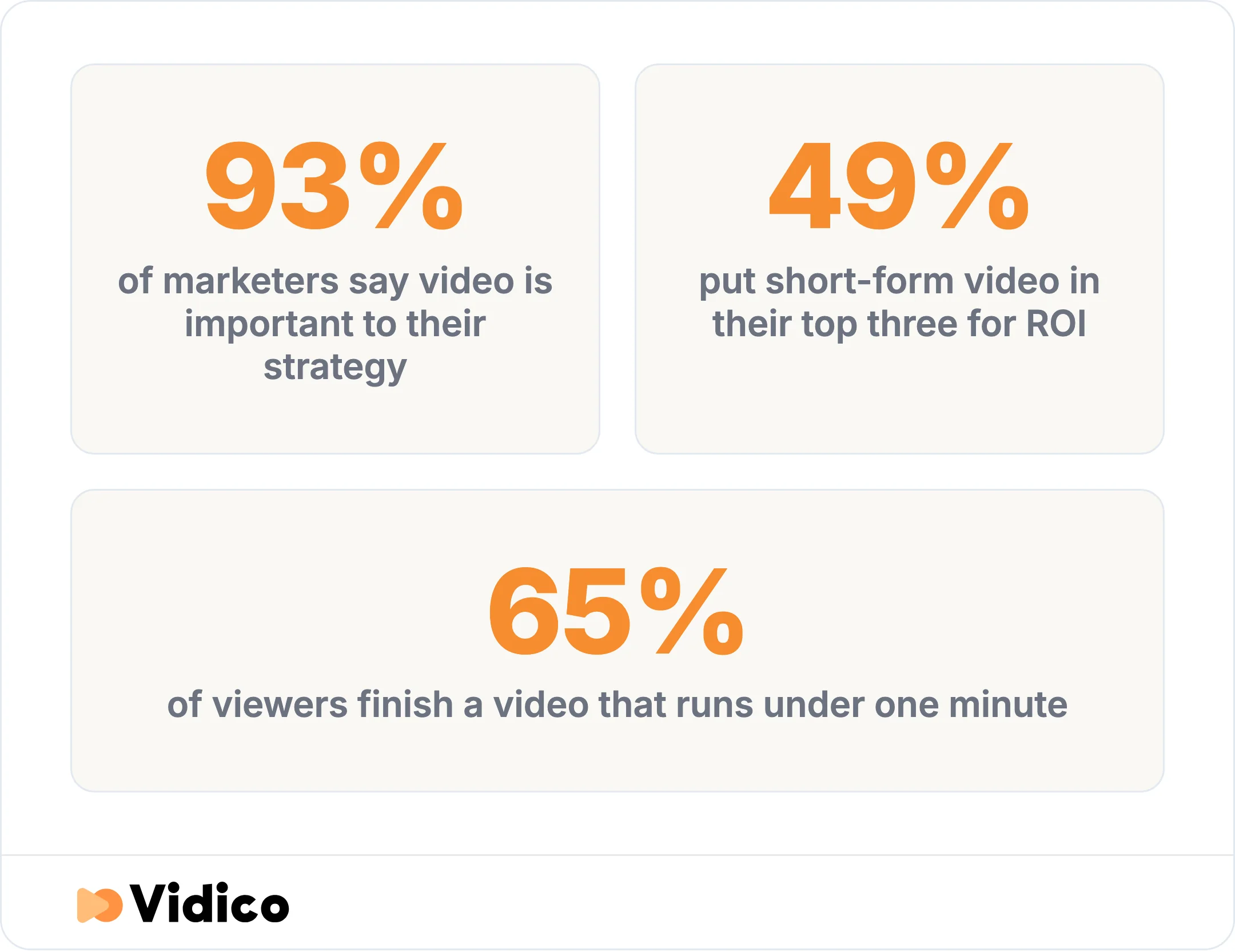
93% of marketers say video is important to their strategy, 49% put short-form video in their top three for ROI, and 65% of viewers finish a video that runs under one minute. Sources: HubSpot, Vidyard.
That is why fintech brands keep investing in financial video production. The examples below show what the money buys when it is spent well.
7 Fintech Explainer Video Examples Worth Studying
We grouped these seven by fintech category so you can jump to the one closest to your product. Each entry covers what the video does, the animation style, and the creative lesson you can apply.
| Example | Category | Style | Length | The move to steal |
|---|---|---|---|---|
| Assembly Payments | Payments infrastructure | Motion graphics | Short-form | Animate the fund flow itself |
| Plaid | Open banking | 2D animation | 60 seconds | Lead with trust and safety |
| Brightflow AI | B2B cash flow | Motion graphics | Short-form | Show the outcome, not the algorithm |
| Chime | Digital banking and credit | Branded explainer | Around 2.5 minutes | Walk a confusing product step by step |
| Klarna | Lending and BNPL | Branded explainer | Step-by-step guide | Make the repayment schedule concrete |
| Unhedged | Investing | Live action plus UI | Short-form | Pair a real founder with product UI |
| Coinbase | Crypto | Branded explainer | Around 2 minutes | Teach the category before selling |
1. Assembly Payments: Making Payment Infrastructure Visible
Assembly Payments is a payments-infrastructure example most roundups miss because they chase consumer brands. The Assembly Payments explainer we produced animates what payment APIs do: they help businesses manage multiple payment workflows and move funds so companies can pay and get paid without delays.
The creative lesson is to animate the flow itself. When your product is invisible plumbing, the video’s whole job is to draw the pipes. Motion graphics turn “we route funds between parties” into arrows, accounts, and money that visibly moves, which no live-action shoot can do as cleanly.
This is the kind of work we build reusable systems around. When the product is an abstract flow, the motion graphics carry the explanation, and that is where these videos win.
2. Plaid: Turning an Invisible Data Layer Into Trust
Plaid’s “How Plaid Works” is a 60-second explainer that leads with trust instead of features. It opens on scale and safety, noting that more than half of Americans with a bank account have used Plaid to connect to an app, then frames the whole video around keeping those financial connections secure.
Steal this: for an invisible data layer, trust is the story. Plaid does not try to explain every technical step. It shows the connection happening and staying protected, which is exactly what a nervous buyer needs to see. It is also recent work, so the animation style feels current rather than dated.
3. Brightflow AI: Explaining an AI Money Tool Without the Buzzwords
The Brightflow AI explainer we produced explains an AI cash-flow platform for small businesses using motion graphics, and it never leans on the word “algorithm” to do the work. It shows the payoff: clearer cash-flow decisions, made faster.
The move to copy: show the outcome, not the engine. For an AI fintech product, the buyer cares about the result on their screen, not the model behind it. Our own approach mirrors this. We use AI to speed the repetitive layer of production, like localization and repurposing, while our creative directors own the brief and every final deliverable. The video’s job is the clear result, and that is what we put on screen.
4. Chime: Explaining Credit Without the Jargon
Chime’s “How Does Chime Credit Builder Work?” takes a genuinely confusing consumer-finance product, a secured credit-builder card, and walks the mechanic step by step. At around two and a half minutes, it spends the time the topic actually needs.
What to take from it: length should follow complexity. A credit-building product cannot be explained in 15 seconds without leaving the viewer more confused. Chime uses plain language and a clear sequence, so the length feels earned rather than padded. When the mechanism is the barrier to signup, explaining it fully is the conversion play.
5. Klarna: Showing a Payment Flow Step by Step
Klarna’s “Pay in 4” explainer makes a buy-now-pay-later flow concrete by showing the four payments as a clear schedule. BNPL lives or dies on whether the buyer believes there is no hidden cost, and the video removes that fear by making the repayment plan visible.
The takeaway: make the schedule concrete. For any lending or credit product, the numbers and the timing are the anxiety. Show them plainly and the fear drops. Hide them behind a friendly voiceover and it grows.
6. Unhedged: Where an Explainer Video Raised $2.3M
The Unhedged crowdfunding video we produced pairs a real founder with animated product UI, and the result is our clearest proof that a fintech explainer can move real money. The campaign it anchored raised $2.3M and hit its minimum target in 45 minutes.
Steal this: pair a real human with the product. Unhedged sells algorithmic investing, which is abstract and easy to distrust. Putting a credible founder on camera next to the product UI does two jobs at once: it explains the mechanism and it gives the viewer a person to believe. For investing and wealth products, that combination of live action and UI is hard to beat.
7. Coinbase: Educating Before Selling
Coinbase’s “What Is Cryptocurrency” explains the category before it explains the product. Part of the brand’s Crypto University series, the roughly two-minute video is built for a beginner who does not yet understand what they would even be buying.
The move: teach the category first when the buyer does not understand it yet. If someone cannot explain crypto to a friend, no product demo will land. Coinbase removes that gap with plain visuals and a beginner-friendly script, and the product becomes the obvious next step once the concept clicks.
What the Best Fintech Explainer Videos Have in Common
Five patterns run through all seven examples. Use them as a checklist before you brief your own video, whether you hire a team or start in-house.
- Open on the cost of the problem. Start with the friction the buyer feels (fees, waiting, confusion), not a feature tour. The product means more once the pain is named.
- Make the invisible visible. Animate the money, data, or approvals moving. The core flow on screen is the explanation.
- Match length to complexity. Aim for 30 to 60 seconds for a simple consumer app and 60 to 90 seconds for most complex or B2B products. Give an education-first or multi-step product the extra time it needs: Coinbase’s crypto primer runs about two minutes and Chime’s credit-builder walkthrough about two and a half, because the topic earns it.
- Bake trust into the visuals. Show security and clarity (a locked connection, clean UI, a real face) instead of stacking disclaimers.
- End on one clear action. One next step, not five. A single signup, demo, or download beats a menu of options.
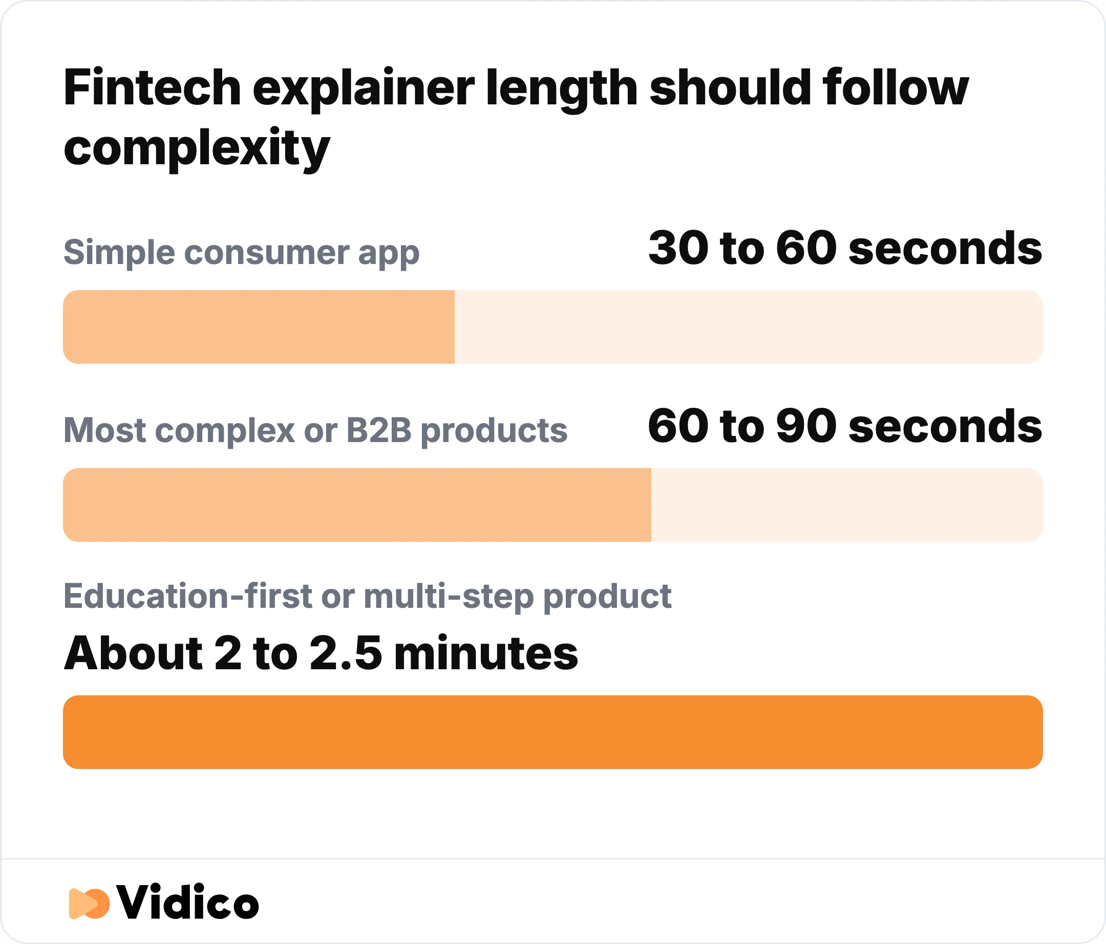
Match fintech explainer length to complexity: 30 to 60 seconds for a simple consumer app, 60 to 90 seconds for most B2B products, and about two to two and a half minutes for an education-first product.
These same principles carry over to paid channels. If you are adapting a hero explainer into performance assets, our guide to fintech ad creative covers how the cutdowns should differ from the full explainer.
Want a competitive read before you brief anything? Our Creative Intelligence Report is a free analysis of how your creative stacks up against your category, delivered in 48 hours.
Animated, Live Action, or AI-Generated: Which Fits Your Fintech Video?
The right format depends on what you need the video to prove. Most fintech products are abstract flows, so animation wins more often than not, but there are clear cases for each.
- Animation and motion graphics fit best when you need to show an invisible flow or an abstract product. Payments, data connections, and cash-flow tools all fall here. This is why most of the examples above use 2D animation or motion graphics.
- Live action mixed with UI fits when a founder or customer story carries the trust, as with Unhedged. A real person on camera builds credibility that animation alone cannot for a high-stakes financial decision.
- AI-generated tools work as a fast, cheap starting point for a rough cut or a script test. They struggle with brand consistency and the harder craft of making an invisible flow feel clear and safe, so they fit early drafts better than a launch asset. Treat them as the DIY option and a professional team as the step up when the video has to convert.
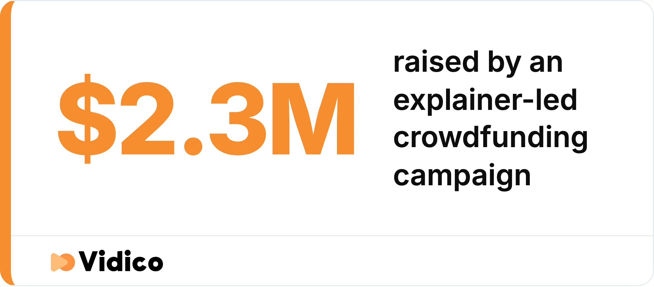
The Unhedged crowdfunding video Vidico produced paired a real founder with product UI, and the campaign it anchored raised $2.3M and hit its minimum target in 45 minutes.
Cost usually decides the final call. A professional fintech explainer typically runs a few thousand dollars for a simple piece, up into the mid-five figures for complex animation. Our explainer video cost breakdown has the current ranges, or you can get a tailored estimate from our 90-second quiz.
Frequently Asked Questions
How long should a fintech explainer video be?
A fintech explainer video should run 30 to 60 seconds for a simple consumer app and 60 to 90 seconds for most complex or B2B products. Match the length to how much the viewer needs to understand before they trust the product. A product that teaches an unfamiliar category, like a crypto primer or a credit-builder card, can run two minutes or more; a straightforward payment app should not.
How much does a fintech explainer video cost?
A professional fintech explainer video generally costs from a few thousand dollars for a short, simple piece up to the mid five figures for complex animation, depending on length, style, and complexity. Our monthly plans start at $5,000 per month and cover video, animation, and design under one fee. Ranges shift with scope, so a quick estimate is the fastest way to a real number.
What style works best for a fintech explainer video?
Animation and motion graphics work best for most fintech products because they can show abstract flows like payments, data movement, and approvals that a camera cannot capture. Live action mixed with product UI works better when a founder or customer story carries the trust, as it did for Unhedged. Pick the style that matches what you need to prove.
What should a fintech explainer video actually explain?
A fintech explainer video should explain one core flow, not the whole feature set. Pick the single action your product removes friction from (sending money, getting approved, connecting an account) and make that one thing clear. Trying to cover every feature is the fastest way to lose the viewer.
The Bottom Line
The through-line across all seven examples is the same: the best fintech explainer videos make money movement watchable and trustworthy, usually in a minute or two. They open on a real problem, animate the invisible flow at the center of the product, and end on one clear step. Whether your product is a payment rail, a lending app, or an investing platform, the job is to make the abstract feel simple and safe.
That is the work we do at Vidico. We build B2B explainer videos for SaaS, tech, and fintech brands from our offices in Melbourne, Sydney, New York, Dubai, and Singapore, with no geo-limitation on where your team sits. If you want to map out the right video for your product, book a free strategy session and we will walk through it with you.
Sources: